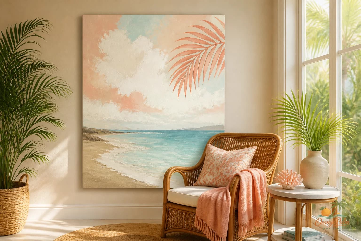
Wall Art Styling
The Laundry Room Needs One Clean Note
A practical Orange Palm Gallery journal on choosing and placing laundry room wall art with restraint, warmth, and modern coastal ease.
August 31, 2026 / 4 min read / Orange Palm Gallery Studio
Source note: this guide is written and maintained by Orange Palm Gallery Studio. Last updated August 31, 2026.
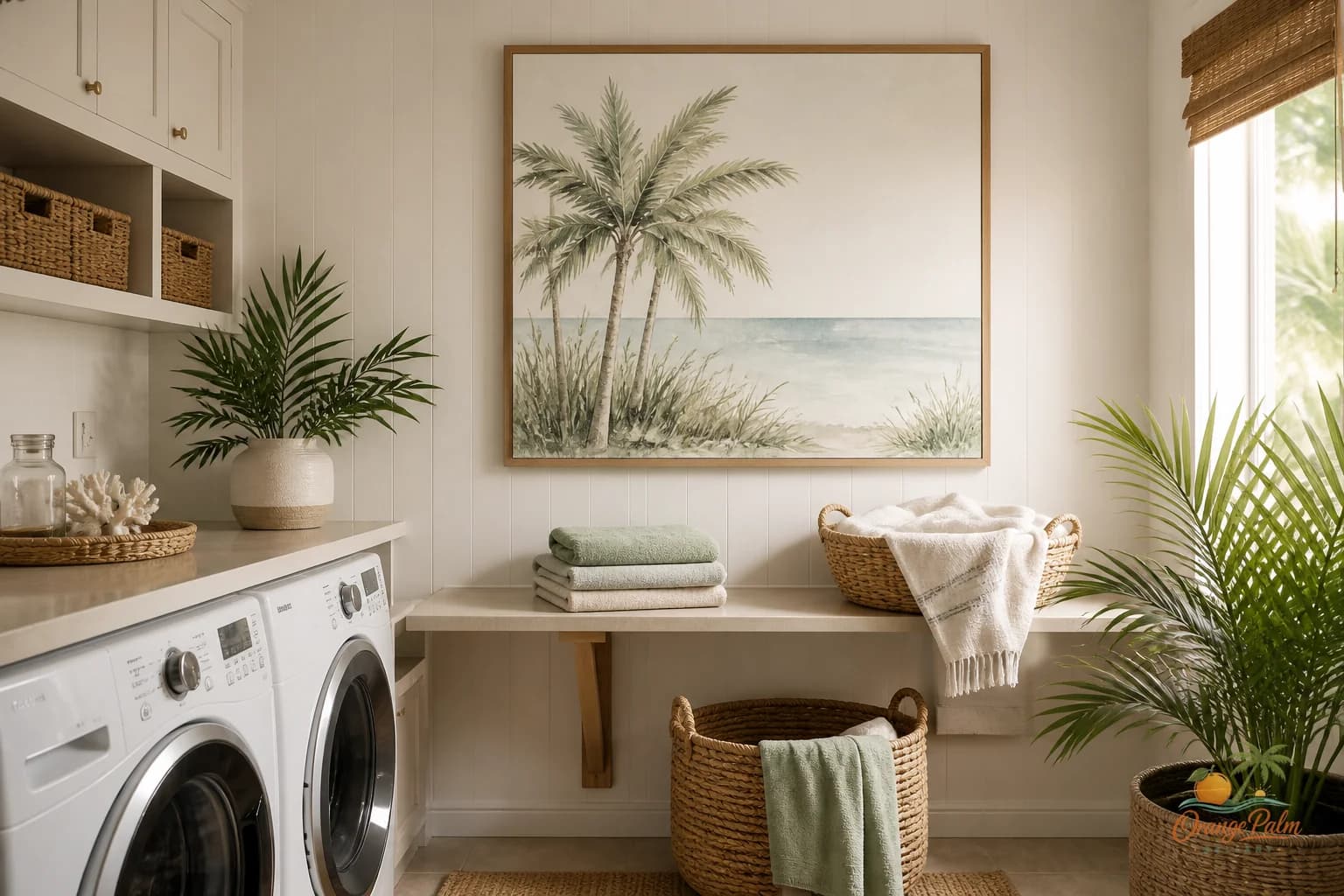
Laundry rooms get treated like a decorating loophole. People either ignore them completely, or they hang a jokey sign that tries to make the chores adorable. Neither choice does much for the room.
A laundry room already has plenty going on. Machine doors. detergent bottles. baskets. tile. cabinet gaps. a sink if you are lucky. wet towels from the pool. school uniforms. beach clothes with sand still hiding in the seams. It is a working room, and that means the wall art has to be calmer than the room itself.
The goal is not to make laundry feel glamorous. That is asking too much from a print. The better goal is simpler: give the eye one clean place to land.
Quick answer
The best laundry room wall art ideas use one clean visual note above a folding counter, beside stacked machines, or near a quiet utility wall. Choose art that calms white appliances, bottles, baskets, and daily mess rather than adding chore-themed noise.
Start with the quietest wall
Do not begin with the biggest wall by default. In a laundry room, the biggest wall is often the busiest one. It may have shelves, hooks, hampers, a drying rack, or a cabinet door that swings through the space.
Look for the quietest wall instead.
That might be the narrow stretch above a folding counter. It might be the wall beside stacked machines. It might be the small open area over a utility sink. The right spot is not always dramatic. It is the place where the art can sit without fighting a row of plastic bottles or a pile of towels.
If the machines dominate the room, use the art to balance them, not compete with them. A vertical piece beside stacked appliances can soften the hard appliance shape. A horizontal piece above a counter can make the room feel more settled. Tiny art over a massive washer and dryer usually looks nervous.
Skip the chore comedy
This is where laundry room decor often goes sideways.
The room does not need to announce that laundry happens there. Everyone knows. The washer is not subtle.
Typography signs can work in some spaces, but laundry rooms are already full of labels, dials, detergent branding, and small instructions. Adding more words can make the room feel busier, even if the sign is technically neat.
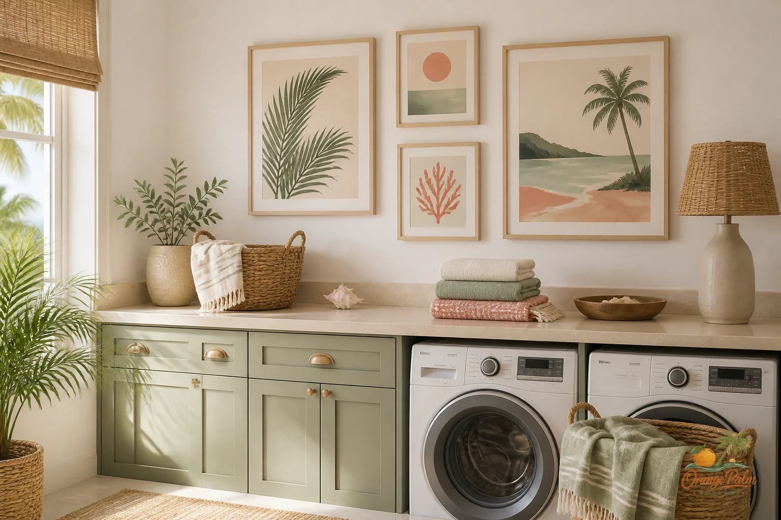
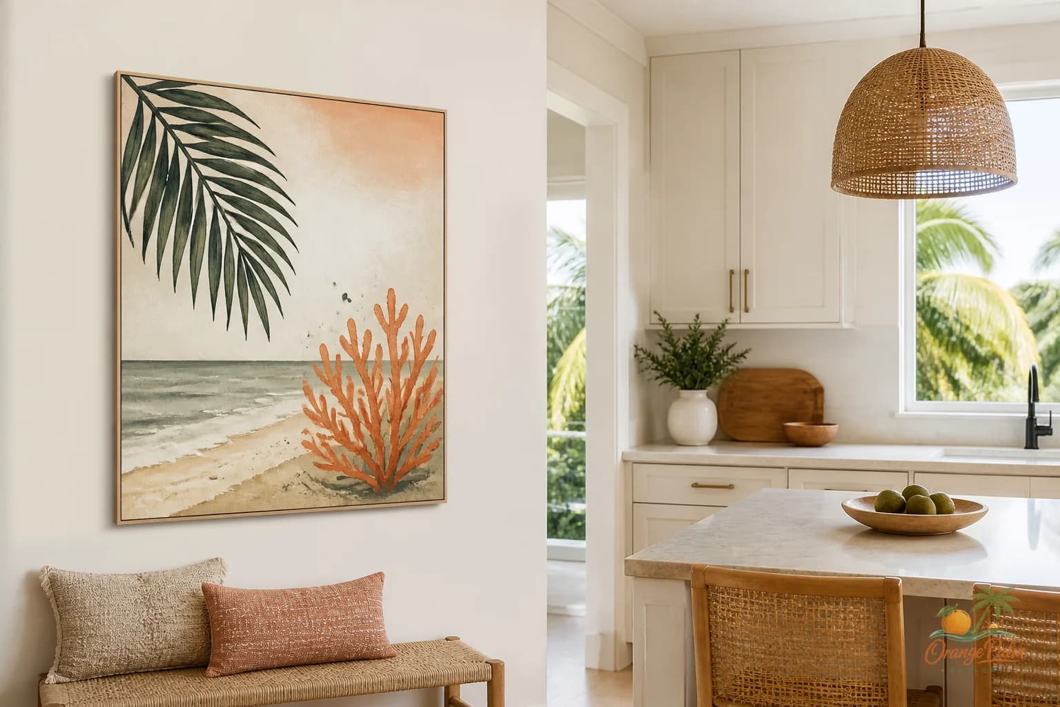
A better choice is visual relief: a soft coastal shape, a quiet abstract, a palm inspired line, a warm sand toned piece, or a simple composition with breathing room. Something that feels clean without becoming clinical.
For a Florida home, this is especially useful. Laundry rooms often catch the evidence of the whole house: swimsuits, towels, linen shirts, sandy socks, market totes, dog towels, beach blankets. The art should not add another shout. It should feel like opening a window.
Use a restrained palette
Laundry rooms tend to have hard whites: white machines, white tile, white cabinets, bright bulbs. If you add more stark white and sharp black, the room can start to feel like a service closet.
Warm white is softer. Sand is friendly. Palm green gives the room a little life. Muted coral can work if the rest of the room is quiet. Ink is better when it is used sparingly, not as heavy black lettering across the wall.
If the room already has patterned floor tile or strong cabinet color, let the wall art be the pause. One quieter piece will usually do more than a busy pair.
The tradeoff is obvious: restrained art may not grab attention in a photo, but it will make the actual room easier to stand in. That matters more.
Scale it like a working room
Laundry room art should feel intentional, but not precious. A single medium piece often works better than a cluster of small frames. Small groupings can look cluttered once baskets, hooks, and supplies enter the picture.
Above a folding counter, leave enough space so the art does not feel like it is sitting on the work surface. Beside stacked machines, let the piece run vertically so it echoes the height of the room. Over a sink, keep it away from splash zones and choose practical framing or protection if the room gets damp.
This is not the place for fragile drama. It is a utility space. The art can still be beautiful, but it should understand where it lives.
Let one piece change the temperature
Good laundry room wall art does not need to tell a story about laundry. It just needs to change the temperature of the room.
A warm coastal piece can take the edge off appliances. A soft palm shape can break up cabinet lines. A quiet abstract can make a narrow room feel less packed. One clean note can make the room feel cared for without turning it into a staged corner.
That is the part people miss. Decorating a laundry room is not about pretending chores are charming. It is about refusing to let a practical space become visually punishing.
If you want a softer starting point, explore Orange Palm Gallery pieces for calm, modern Florida inspired homes at orangepalmgallery.com.