Wall Art Styling
Entryway Wall Art Sets the Weather of the House
How to style entryway wall art with scale, color, and restraint for a calm modern coastal home.
August 24, 2026 / 4 min read / Orange Palm Gallery Studio
Source note: this guide is written and maintained by Orange Palm Gallery Studio. Last updated August 24, 2026.
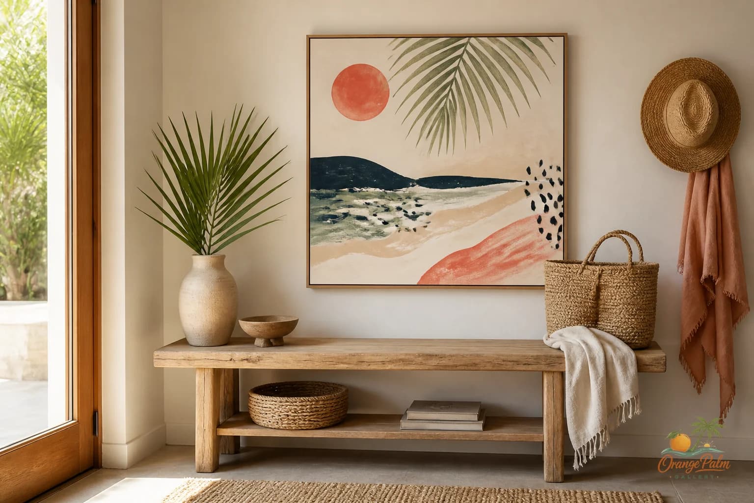
The entryway is where a house tells on itself.
Not in a dramatic way. More like the first five seconds after someone steps inside. Is the place calm? Is it trying too hard? Does it feel collected, or did the wall get whatever art was left after the living room was finished?
People often treat entryway wall art like a greeting card. A phrase, a slogan, a cheerful announcement. That can work in some homes, but it gets tired fast. The entryway already says hello. The art does not need to wave both arms.
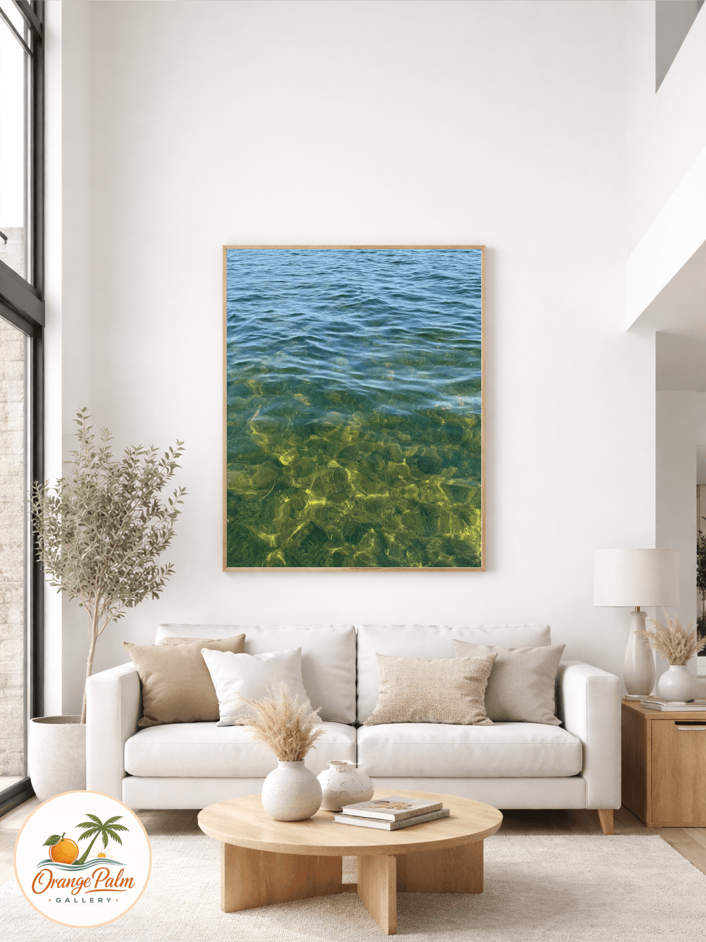
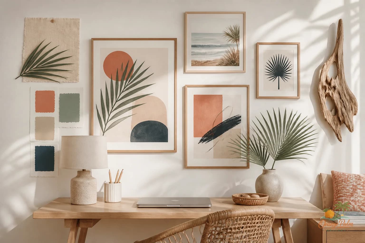
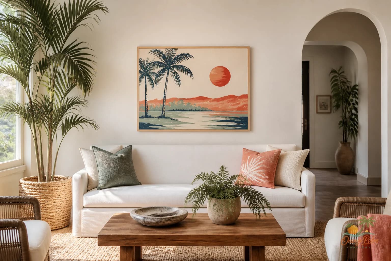
For a Florida inspired home, I like the entry to feel like shade after sun. Warm, quiet, a little textured. Not beach themed in the obvious way. No need for a full cast of shells, boats, and turquoise. A better entryway borrows from Florida in smaller pieces: limestone white, palm green, sun faded coral, sandy beige, a little ink for structure.
Start with the walk in, not the wall
The mistake is choosing art while staring at a blank wall straight on. That is not how the entryway is experienced.
You enter at an angle. You put down keys. You pass through with groceries. You see the wall from the front door, from the hallway, maybe from the living room. So the art needs to hold up in motion.
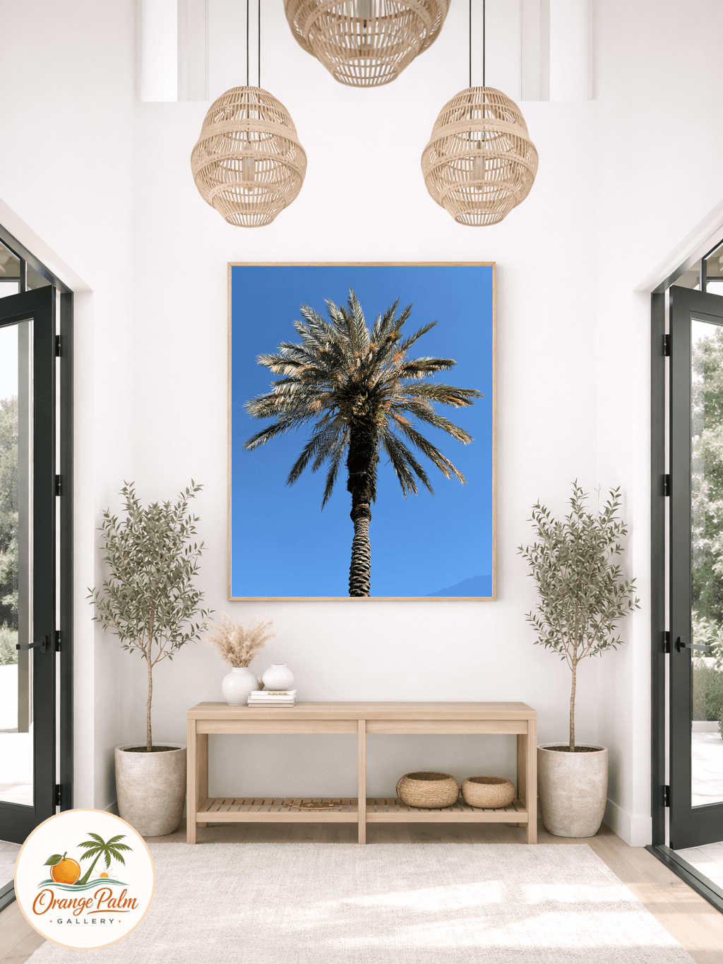
A single medium or large piece often works better than a cluster in a tight entry. It gives the eye one place to land. If the entry is narrow, too many small pieces can start to feel like visual chatter. The house has barely begun and already the wall is talking over itself.
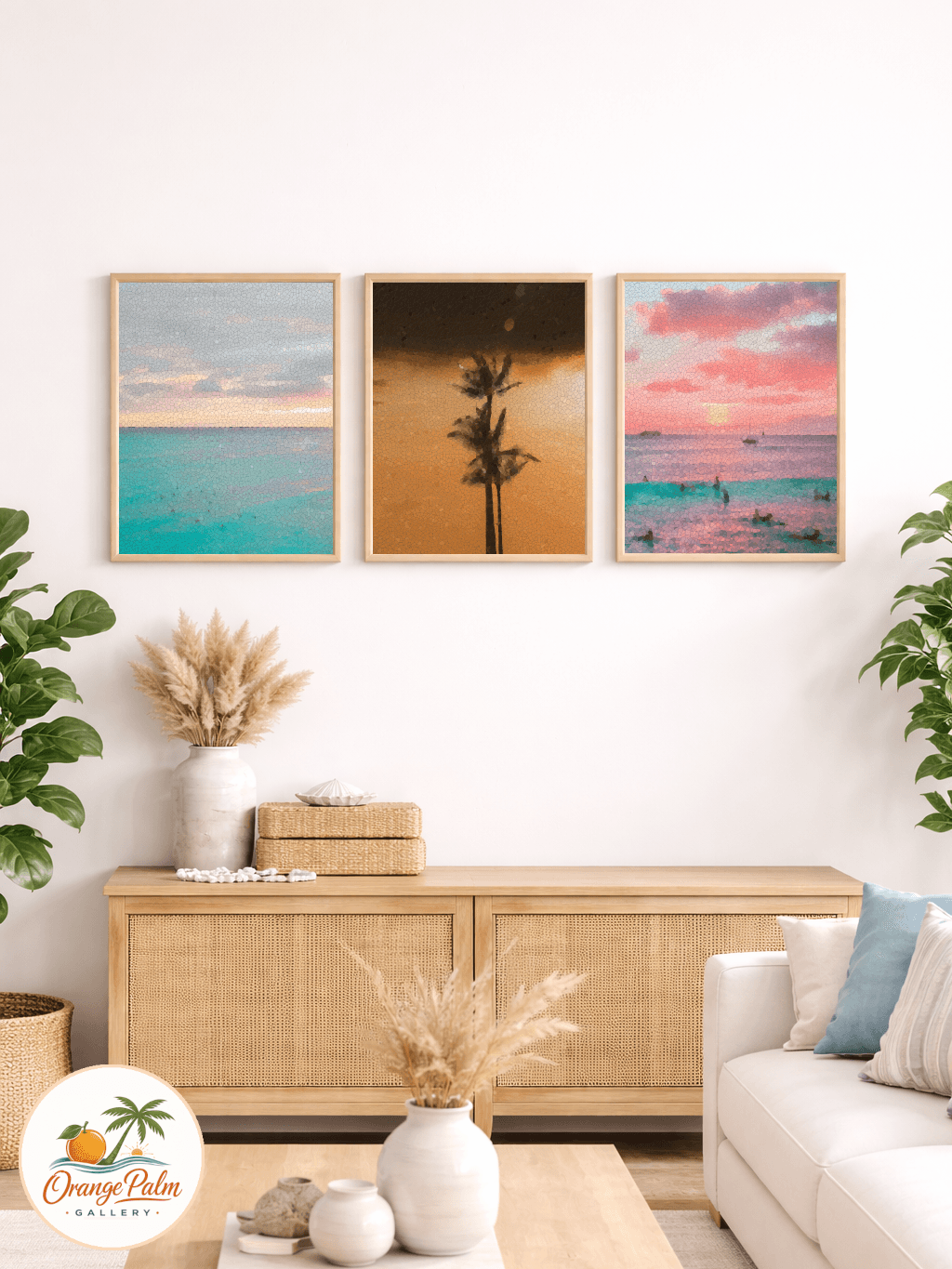
If you do want a small grouping, keep the spacing disciplined. Two pieces stacked vertically can be beautiful beside a console. Three small works in a row can work if the wall is long enough. But avoid the tiny scattered arrangement that looks like it is apologizing for not being one strong choice.
Let the entryway set the palette
Entryway art has a job beyond filling space. It can set the color temperature for the rooms beyond it.
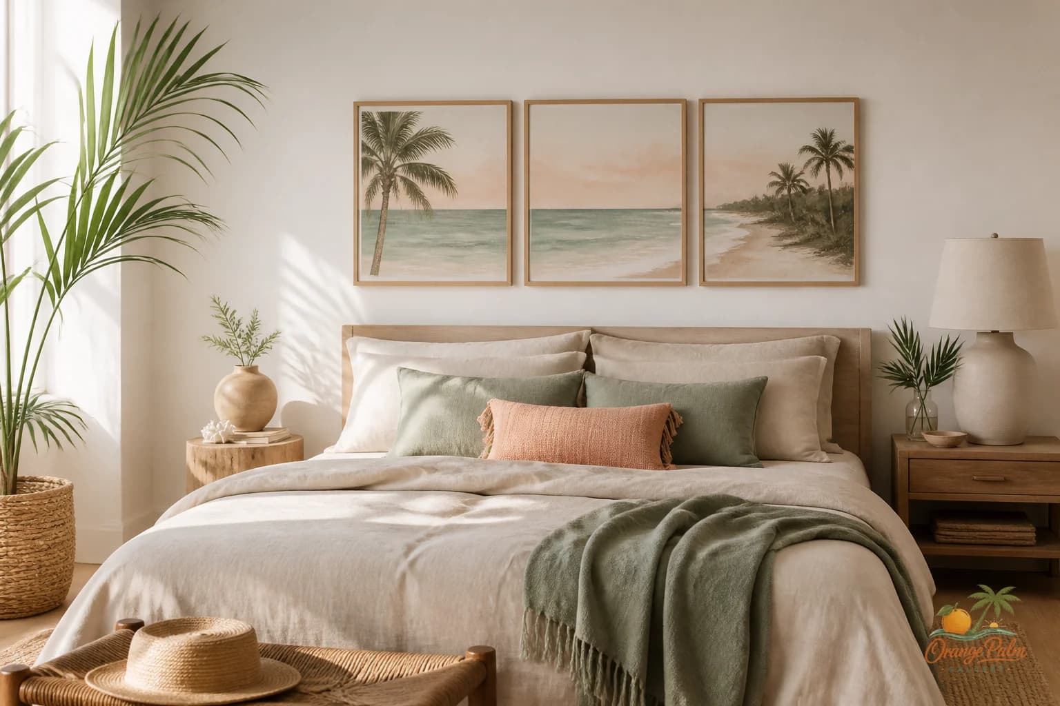
If the main rooms are full of warm whites, cane, oak, linen, and greenery, the entry art should not suddenly go icy blue and glossy black unless you want that contrast on purpose. A soft coastal palette can do a lot with restraint: warm white ground, muted sand, clay coral, olive palm, charcoal linework.
The tradeoff is simple. Softer art may not be the loudest thing in the room, but it makes everything near it look more settled. A bright, busy piece might feel exciting for a week, then start making the console, mirror, basket, and lamp feel like they are all competing for attention.
Florida light is already strong. The entryway does not need to manufacture glare.
Watch the console trap
A console table under entryway art can look effortless, but it is also where good walls go to get cluttered.
The usual formula is art, lamp, bowl, stack of books, vase, tray, candle, basket, mirror, plant, and then maybe another object because the left side felt empty. Suddenly the wall art is no longer art. It is part of a prop pile.
Give the artwork breathing room. If the piece has a quiet composition, do not crowd it with tall stems that cut across the image. If the art is graphic and structured, keep the objects below softer and lower. One lamp, one bowl, one natural texture is often enough.
The empty space around art is not wasted. It is what lets the piece do its work.
Scale it like a threshold
Entryways are thresholds, not galleries. The art should feel proportional to the passage.
Above a console, aim for art that feels connected to the furniture below it without matching its exact width. Too small and it floats. Too wide and the whole setup feels jammed against the architecture. In a narrow entry, leave more wall visible around the piece so the room can breathe.
If there is no furniture below, hang the art where the body naturally meets the wall. Not too high. Not hovering near the ceiling. Entryway art should greet at human height, like something placed by hand rather than installed by formula.
Choose mood before motif
A palm shape can be beautiful. So can a shoreline curve, a shell contour, a block of coral, or a loose botanical line. But the motif is less important than the mood.
Ask what the entry should feel like at the end of a long day. Cooler? Warmer? More grounded? More open? Then choose art that supports that feeling.
For Orange Palm Gallery, the sweet spot is calm modern Florida energy: sun warmed but not loud, coastal but not themed, handmade feeling without looking rustic. If that is the direction you want, the entryway is a good place to start because it influences every room after it.
You can explore more wall art and styling ideas at https://orangepalmgallery.com/?utm_source=mdx.
The entryway does not need to impress anyone. It needs to lower the volume, set the weather, and make the rest of the house feel intentional before a single word is said.