Wall Art Styling
The Entry Wall Should Lower the Volume
Entryway wall art ideas for a warm modern coastal home, with placement, color, and scale advice inspired by Florida light and handmade studio texture.
October 9, 2026 / 4 min read / Orange Palm Gallery Studio
Source note: this guide is written and maintained by Orange Palm Gallery Studio. Last updated October 9, 2026.
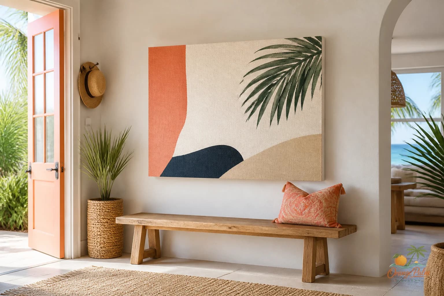
The entry wall has a job before it has a style. It has to calm down the keys, shoes, bags, mail, leashes, sunglasses, and whatever else lands there before anyone has fully arrived.
That is why entryway wall art should lower the volume, not announce the whole personality of the house in one loud rectangle.
A lot of people treat the entry like a preview wall. They cram in the mirror, the quote, the basket, the hooks, the family photo, the seasonal wreath, and one print that was supposed to make the whole thing feel finished. The wall ends up working too hard. It becomes another pile, just vertical.
The better move is simpler and a little stricter: give the entry one clean visual note.
Start with the mess that is already there
Entryways are rarely blank in real life. Even the neat ones have interruption built in. A door swing. A switch plate. A narrow bench. A shoe tray. A coat hook that never looks as tidy as it did in the photo.
So the wall art should not compete with all of that. It should be the steady thing.
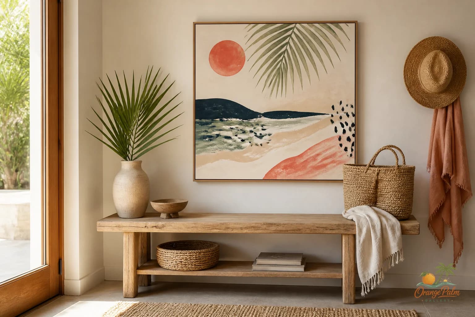
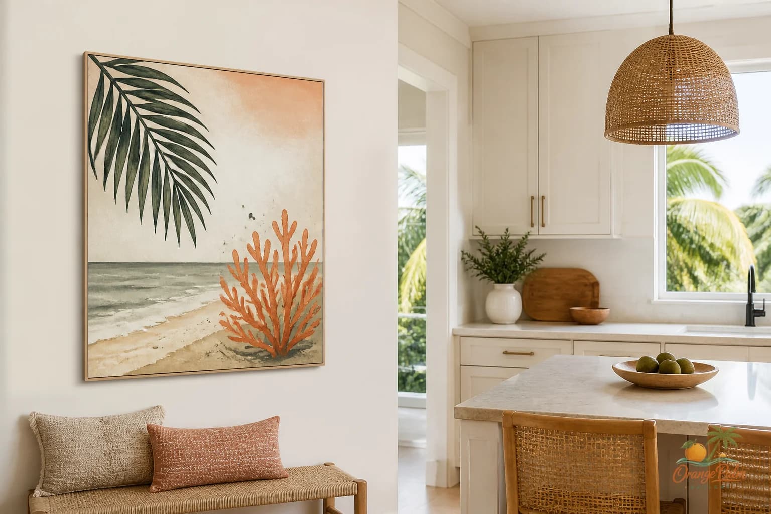
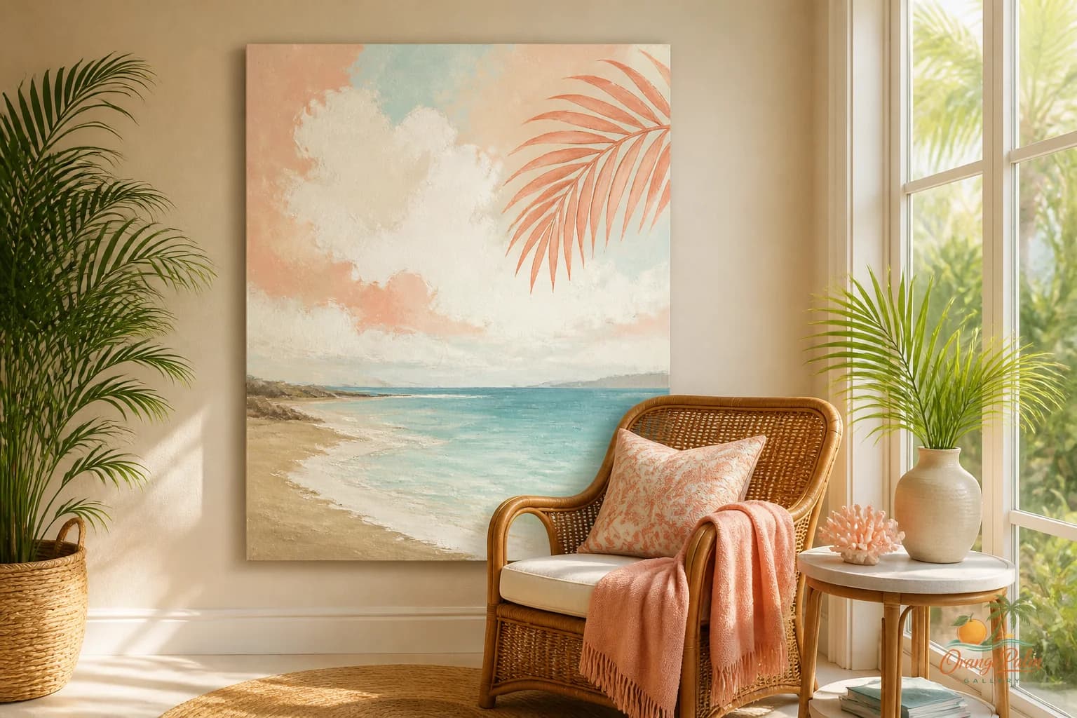
For a warm modern coastal space, I like art that feels sunlit without getting sugary. Think sand, warm white, palm green, ink, and a little coral if the room can handle it. Not beach signs. Not a literal vacation mood. More like the color of late afternoon on a stucco wall, or the green shadow of a palm leaf crossing the floor.
That kind of palette gives the entry a breath without turning it into a theme.
Choose the shape based on the furniture below it
If there is a slim bench or console, a horizontal piece usually feels grounded. It echoes the line of the furniture and makes the whole zone feel intentional. The tradeoff is that a horizontal piece needs breathing room at the sides. If the wall is chopped up by a door frame or closet trim, it can start to feel squeezed.
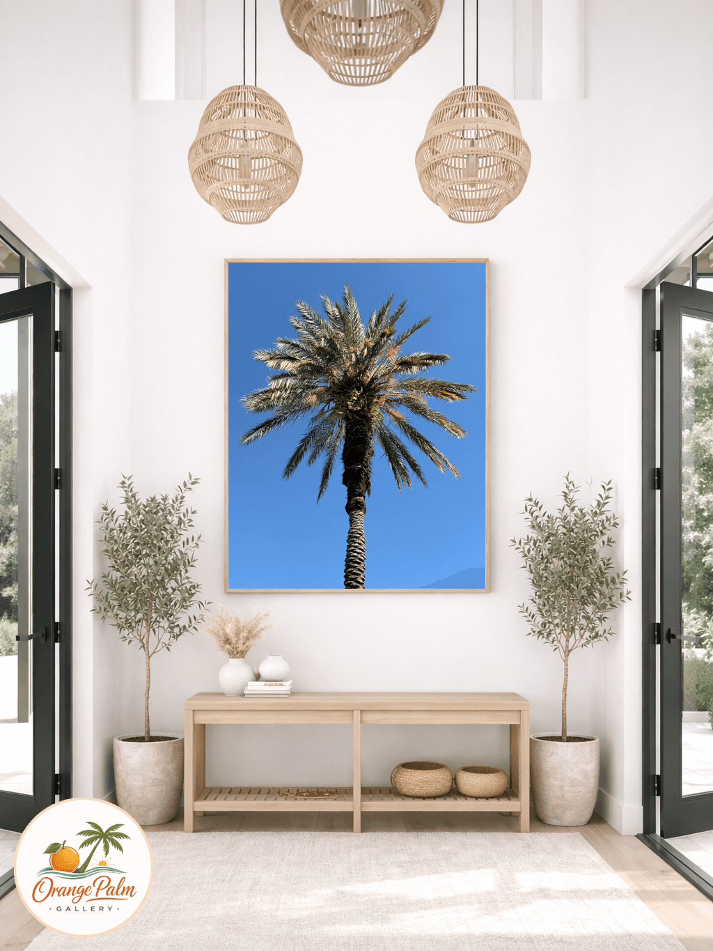
If the entry is narrow or the furniture is small, a vertical piece can be better. It pulls the eye up and gives a tight space some height. This works especially well near a front door where floor space is already doing too much.
Square art is the quiet middle. It can look calm above a small bench, stool, or shelf, but it needs enough negative space around it. Too small and it looks apologetic. Too large and it becomes a stop sign.
The point is not to fill the wall. The point is to make the wall feel decided.
Hang it lower than you think, but not lazily low
Entry art often gets hung too high because people are thinking about the whole wall instead of the moment of arrival. If there is furniture below it, leave a clean gap, often around a hand span or a little more, depending on the scale. The art should relate to the piece below it, not float away from it.
If there is no furniture, hang for standing eye level. The center of the piece should feel natural when someone walks in, not when they are studying the ceiling.
A good entry wall does not need drama. It needs composure.
Let one color do the welcoming
This is where Florida-inspired color can be beautiful if it stays disciplined. A tiny hit of coral can warm an otherwise neutral entry. Palm green can make a white wall feel less empty. Ink can sharpen a soft palette so the whole corner does not go sleepy.
But do not use every cheerful color just because the entry is the first impression. First impressions are better when they are edited.
If the surrounding area already has wood, woven texture, tile, or brass, keep the art quieter. Sand and warm white with a dark ink line can be enough. If the entry is plain and flat, let the art carry one stronger color, not five.
Keep the frame of mind coastal, not the checklist
Coastal decor gets weak when it becomes a list of objects. Shell, wave, palm, bird, rope, blue. The entryway does not need to prove where it lives.
It can suggest light instead. It can suggest air. It can carry the warmth of Florida without becoming a souvenir wall.
That is the studio note I come back to often at Orange Palm Gallery: the most useful wall art usually gives a room one clearer feeling. Not more stuff. Not more explanation. Just a better pause.
For more calm, modern Florida-inspired wall art and styling notes, visit Orange Palm Gallery.
A simple entry wall formula
Use one main piece of art.
Give it enough space to breathe.
Repeat one color from the room, but do not match everything.
Let the art sit close enough to the furniture below it to feel connected.
Avoid anything too busy near hooks, baskets, or shoe storage.
That is plenty. The entry is not a gallery opening. It is the place where the house takes its first breath.