Wall Art Styling
Dining Room Wall Art Should Leave Room for the Table
How to style dining room wall art with Florida-inspired restraint, better scale, and enough visual breathing room for the table to stay central.
August 14, 2026 / 4 min read / Orange Palm Gallery Studio
Source note: this guide is written and maintained by Orange Palm Gallery Studio. Last updated August 14, 2026.
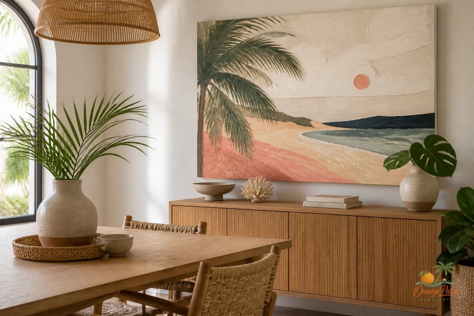
A dining room is one of the easiest rooms to overdecorate because people treat the empty wall like a stage.
That is usually where it starts to go wrong.
The table is already doing a lot. It has length, legs, chairs, glassware, shadows, flowers, plates, napkins, and all the small evidence of actual use. If the wall art tries to become the loudest object in that mix, the room stops feeling gathered and starts feeling arranged for a listing photo.
For a warm modern Florida home, I would rather see the dining room wall act like climate: soft, steady, full of light, and not begging to be noticed every three seconds.
Quick answer
Dining room wall art placement works best when the table remains the center of the room. In calm modern coastal homes, choose art with enough scale to hold the dining zone, enough warmth to set the mood, and enough restraint to leave room for the table.
Let the table stay in charge
The biggest tradeoff in dining room art is attention.
A strong piece above a sideboard or on the main dining wall can give the room a focal point, but it should not steal the center from the table. The dining table is where the room earns its keep. The art is there to set the temperature.
If your table is dark wood, heavy, or rectangular, a lighter coastal inspired piece can loosen the room. Think warm white, sand, faded coral, palm green, a little ink linework. If the table is pale or minimal, the art can carry more contrast, but keep the composition calm enough that chairs and place settings do not feel like visual clutter.
What people often get wrong is choosing dining room art the way they choose art for a hallway: something narrow, safe, and vaguely decorative. A dining room usually needs more confidence than that. Not noise. Confidence.
Scale it to the furniture, not the wall
Do not measure the blank wall first. Measure the furniture relationship.
If the art hangs above a sideboard, buffet, or console, it should feel connected to that piece. Too small and it looks timid. Too high and it floats away like an afterthought. Too wide and it bullies the furniture below it.
A good starting point: let the art occupy enough visual width to relate to the sideboard, while leaving breathing room at the edges. The bottom of the piece should sit low enough that it feels paired with the furniture, not stranded in the upper half of the wall.
For a wall with no furniture below it, the table becomes the anchor. In that case, the art should align with the dining zone, not simply the midpoint of the largest wall. Centering on architecture can be technically correct and still feel wrong when the table sits somewhere else.
That is the dining room problem in plain English: the wall might be symmetrical, but the room is lived from the table.
Use color like seasoning
Florida inspiration gets flattened fast when every room turns into turquoise plus seashell plus palm print. A dining room deserves more restraint.
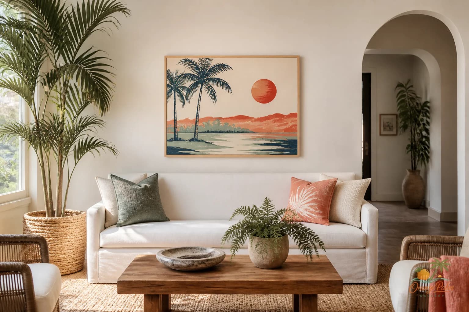
A better palette is quieter: warm white walls, sand or oak tones, palm green in small amounts, ink for definition, coral as a low note rather than a punchline. The art can echo the light outside without turning the room into a beach theme.
If your dining chairs are woven, cane, rattan, oak, linen, or leather, a piece with handmade texture or loose organic geometry can make the room feel more collected. If the room already has patterned upholstery or a busy rug, go simpler on the wall. Let one element carry the rhythm.
The dining room is not a showroom for every coastal reference you like. It is a place where a few materials need to agree with each other.
One piece is often better than a gallery wall
Gallery walls can work in dining rooms, but they ask for discipline. The problem is not the number of pieces. The problem is all the little edges and gaps competing with chair backs, pendant lights, and table settings.
If the room is modest, one larger 2D artwork often feels calmer than six small pieces trying to create importance by committee. A single piece gives the eye somewhere to land between conversations. It also makes the dining area feel intentional without making every dinner feel like it is happening inside a retail display.
If you do choose multiple pieces, keep the spacing quiet and the palette tight. Repetition helps. Too many sizes, subjects, and tones can make the wall feel like it was solved in a hurry.
Match the mood to the meal
Dining room wall art should carry a little patience.
Not sleepy. Not bland. Just patient.
The best pieces for this room tend to have enough structure to hold a wall and enough softness to let people settle in. Abstract coastal shapes, palm influenced linework, sun washed color fields, or simple modern compositions can all work if they respect the table.
Before you hang anything, stand where someone would actually sit. Look at the wall from a chair, not from the doorway. That view tells you more. If the art feels harsh from the seat, it will feel harsher over a long meal. If it feels too tiny from the chair, it will disappear once the table is set.
A dining room wall does not need to perform. It needs to hold the room steady while the table does the living.
For more calm, modern Florida-inspired wall art and styling notes, you can explore Orange Palm Gallery at orangepalmgallery.com.