Wall Art Styling
The Breakfast Nook Only Needs One Quiet Wall
How to style breakfast nook wall art with restraint, warm coastal color, and better placement for a calm Florida-inspired eating corner.
August 12, 2026 / 4 min read / Orange Palm Gallery Studio
Source note: this guide is written and maintained by Orange Palm Gallery Studio. Last updated August 12, 2026.
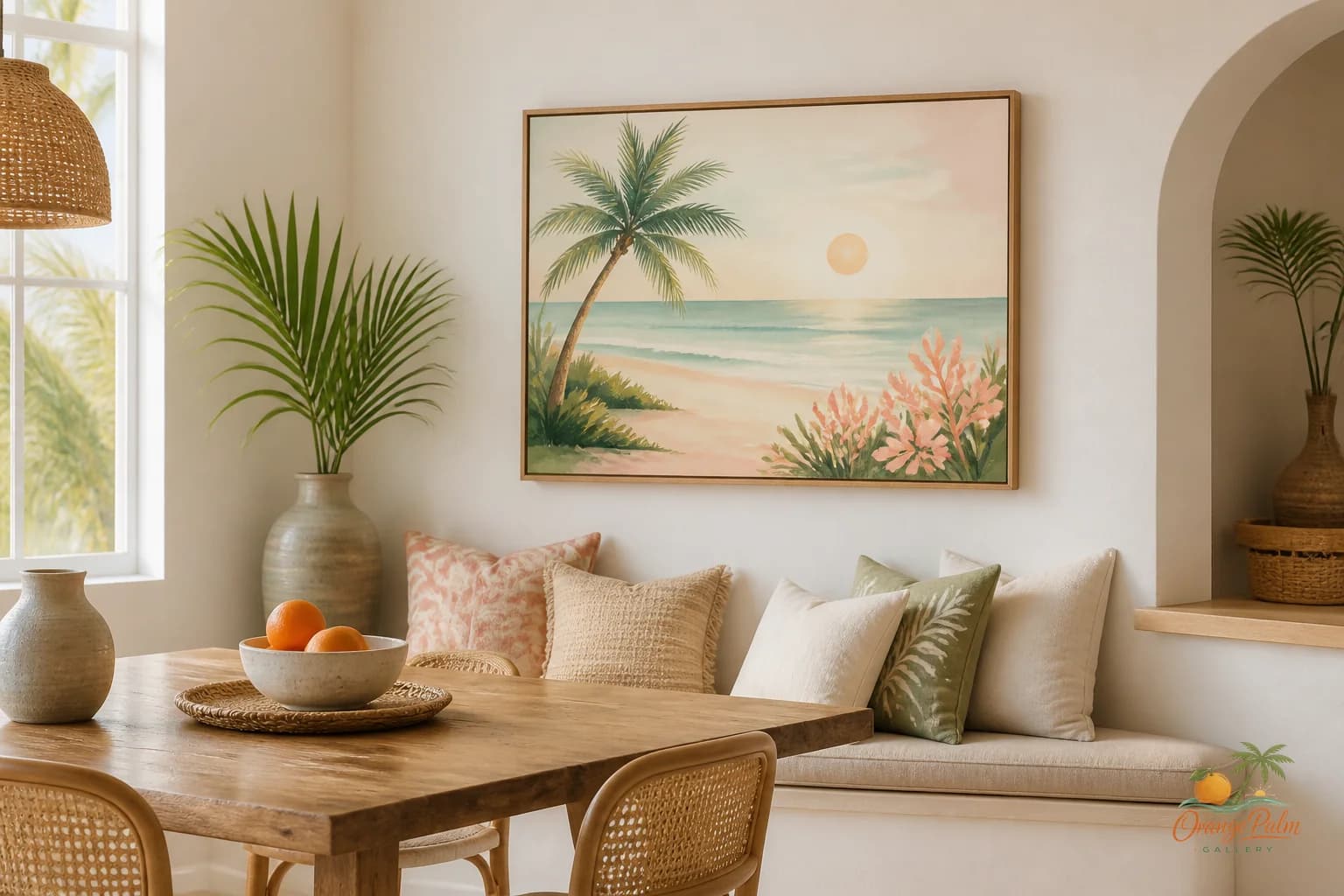
A breakfast nook is small enough that every object gets loud fast. The table legs, chair backs, window trim, pendant light, napkins, mugs, fruit bowl, all of it sits in the same little pocket of space. Add too much wall art and the corner stops feeling charming. It starts feeling like a cafe wall that could not say no.
The tradeoff is simple: one wall gets the visual job. The other surfaces get to breathe.
That sounds almost too restrained, but it is usually what makes a breakfast nook feel designed instead of decorated. A nook does not need to perform like a dining room. It needs to hold a morning mood. A place for coffee. A bowl of cereal. A slow weekend plate. The art should support that rhythm, not shout over it.
Quick answer
The best breakfast nook wall art ideas start with one quiet focal wall, a piece scaled to the bench or table, and enough blank space for the small eating corner to breathe. Choose art that supports the morning mood instead of making the nook feel like a themed cafe.
Start with the seat, not the blank wall
People often start by asking, “What should I put on this empty wall?” That is how small rooms get cluttered. In a breakfast nook, start with the seat instead.
Where does your eye land when you sit down? Where does the light hit first? Which wall is visible from the kitchen or living area? That is the wall worth treating.
If your nook has a built in bench, the art usually belongs above the bench, centered to the seating area rather than the full wall. A common mistake is centering art on the longest stretch of drywall, even when the table and bench sit off to one side. The result feels technically centered and visually wrong.
Let the furniture define the composition. The wall art should belong to the nook, not to the architecture alone.
Keep the piece lower than instinct says
Small eating corners expose floating art. If a print sits too high above a bench or chair rail, it looks nervous, like it is trying to avoid the table.
For a breakfast nook, a calmer move is to hang the piece low enough to relate to the seated area. You want the art to feel connected to the tabletop conversation, not stranded near the ceiling. Leave enough room so chair backs and shoulders are not fighting it, but do not treat the upper wall as the target.
A quiet piece placed slightly lower can make the whole corner feel warmer. It pulls the eye down into the human part of the room.
Choose one steady shape
A breakfast nook can handle a gallery wall, but it has to earn it. Most of the time, one larger 2D piece is better than five small ones. Tiny frames multiply edges. Edges create visual chatter. In a room where the table already adds circles, rectangles, legs, and shadows, that chatter builds quickly.
A single vertical piece can work beautifully on a narrow side wall. A wider horizontal piece can settle the space above a bench. A square piece can calm a corner where the window, table, and pendant are already competing.
The point is not that one format is correct. The point is that the shape should answer the room. If the nook feels tall and narrow, give it a vertical pause. If it feels stretched and low, give it a horizontal anchor. If it feels busy, do not add a busy arrangement just because the wall is blank.
Blank space is not failure. In a breakfast nook, blank space is often the thing that lets the art work.
Let coastal color be quiet
Florida-inspired color does not have to mean bright turquoise and beach signs. A breakfast nook usually does better with sun softened tones: warm white, sand, palm green, a little coral, and enough dark ink to keep the room from becoming sugary.
If the nook gets strong morning light, choose art with some depth or grounding color. Pale art in hard sun can disappear. If the corner is shaded, warmer tones can bring it back to life without making it loud.
This is where coastal decor gets misunderstood. The best version is not a theme. It is a temperature. Warm, easy, slightly sun washed, with a natural rhythm to the shapes.
Do not decorate every side of the nook
A nook is a corner, not a showroom. If one wall has the art, the nearby window can stay simple. The table can stay useful. The pendant can do its job. The eye needs somewhere to rest between objects.
Try this: remove one decorative thing before adding another. If the nook already has patterned cushions, a visible light fixture, and open shelving nearby, choose quieter wall art. If the seating is plain and the walls are bare, the art can carry more presence.
Restraint is not emptiness. It is editing.
At Orange Palm Gallery, we tend to think of wall art as a way to set the pace of a room. In a breakfast nook, that pace should be unhurried. One calm piece, placed with the seating and light in mind, can make a small corner feel finished without making it feel full.
Explore more calm, modern Florida-inspired wall art and styling notes at Orange Palm Gallery.