Wall Art Styling
The Bathroom Wall Does Not Need a Seashell Joke
Orange Palm Gallery journal on styling bathroom wall art with calm coastal color, clean placement, and enough visual restraint for a small room.
October 12, 2026 / 4 min read / Orange Palm Gallery Studio
Source note: this guide is written and maintained by Orange Palm Gallery Studio. Last updated October 12, 2026.
The studio numbers were quiet today: 0 Orange Palm Gallery visitors, 0 pageviews. That kind of quiet can feel rude, but it also gives a room to think without performing. So I kept circling back to the smallest wall in the house, the bathroom wall, because it is where a lot of good art decisions get weirdly unserious.
People decorate bathrooms like the room needs a punchline.
A shell. A fish. A phrase about getting naked. A blue thing because water exists nearby.
The tradeoff is simple: the bathroom is small, so every visual choice gets louder. A joke print that might disappear in a hallway can take over the whole room once it is trapped between tile, mirror glare, chrome, towels, bottles, and a door that is always half open.
Let the bathroom stay clean, not empty
A bathroom does not need to be blank to feel clean. Blank can be sterile. Clean is different. Clean means the eye has somewhere to land and nowhere it has to wrestle.
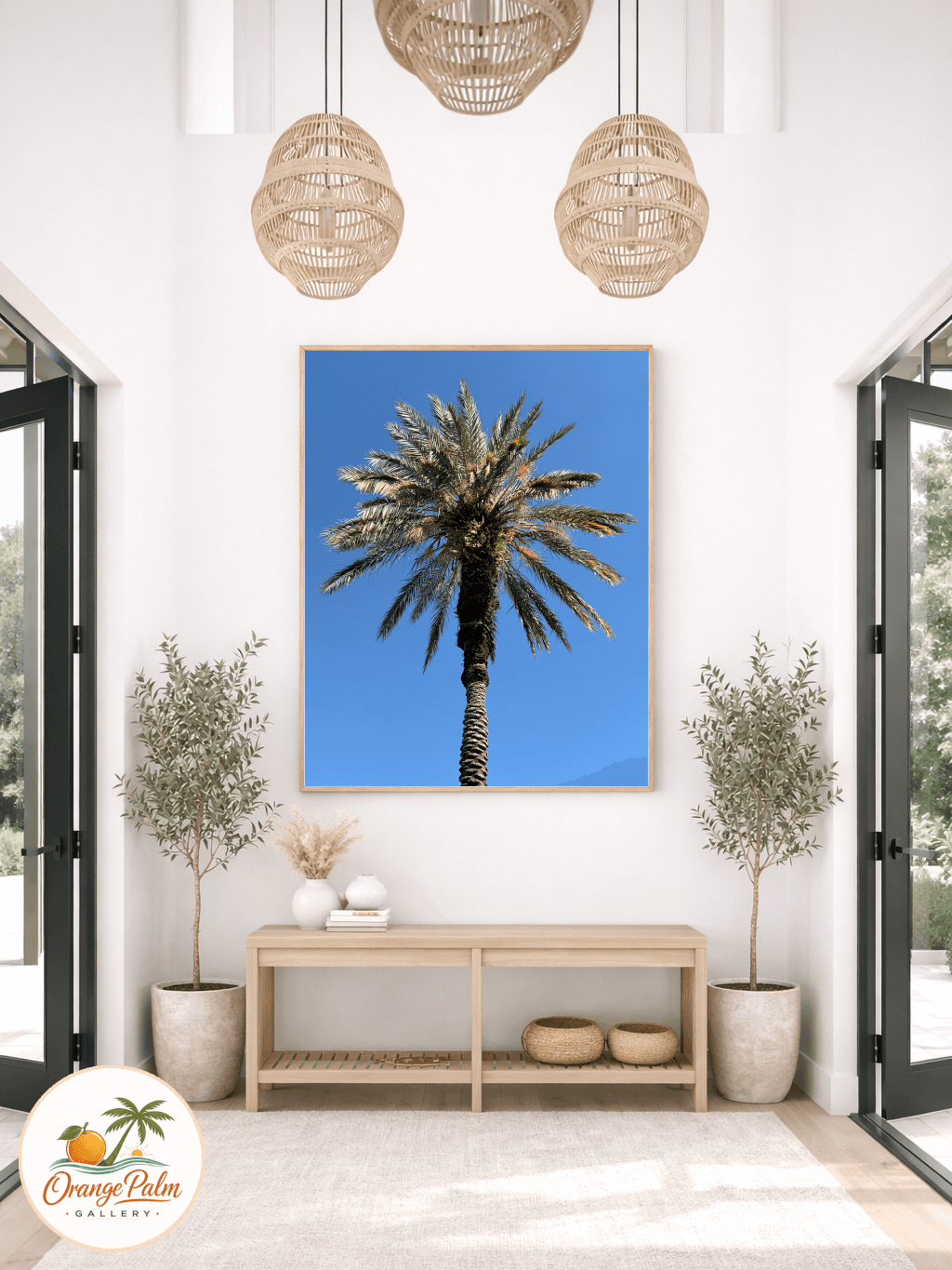
For a warm modern coastal bathroom, I would rather see one steady piece than a set of tiny themed prints. One vertical artwork over a towel bar. One square piece above a low shelf. One quiet abstract on the wall opposite the mirror, where it can be reflected without doubling the noise.
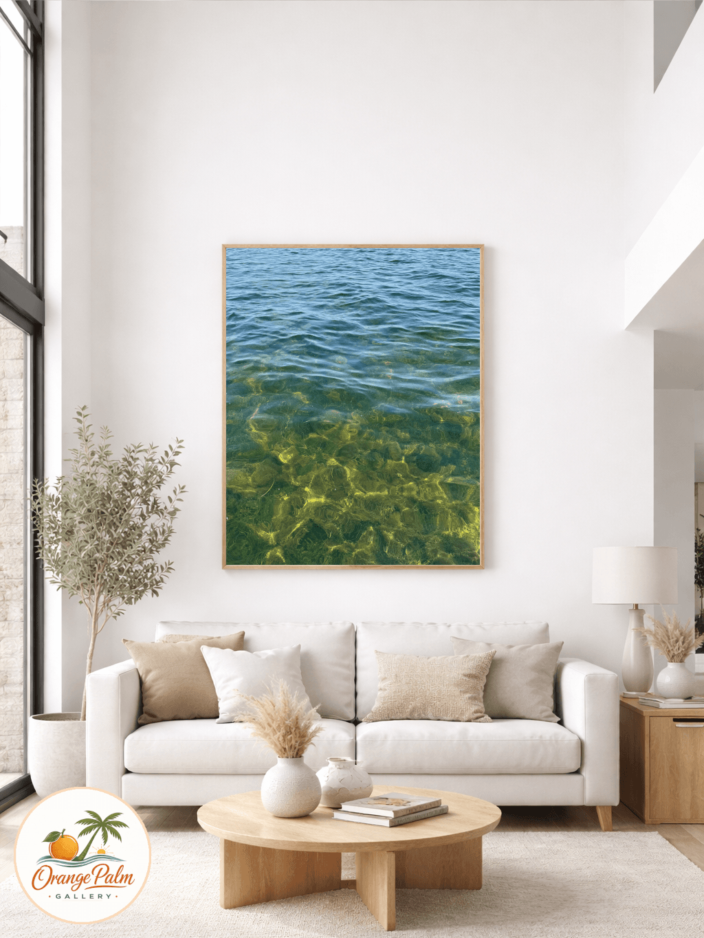
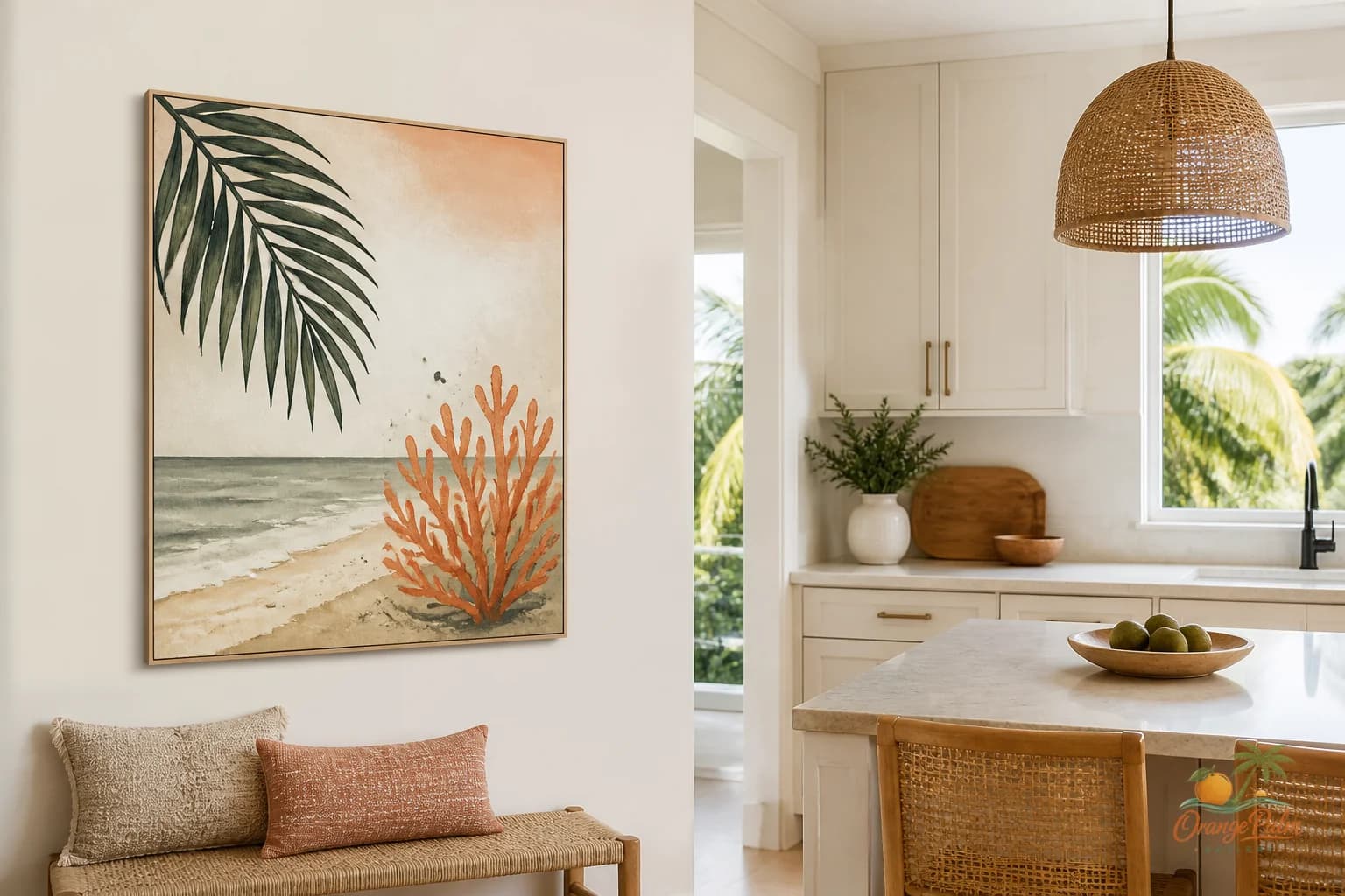
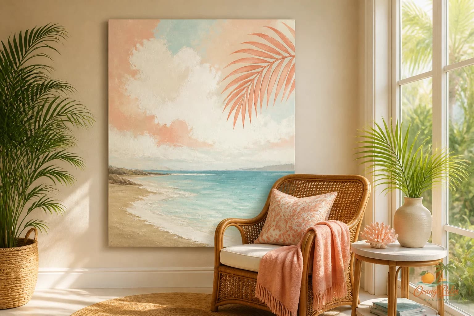
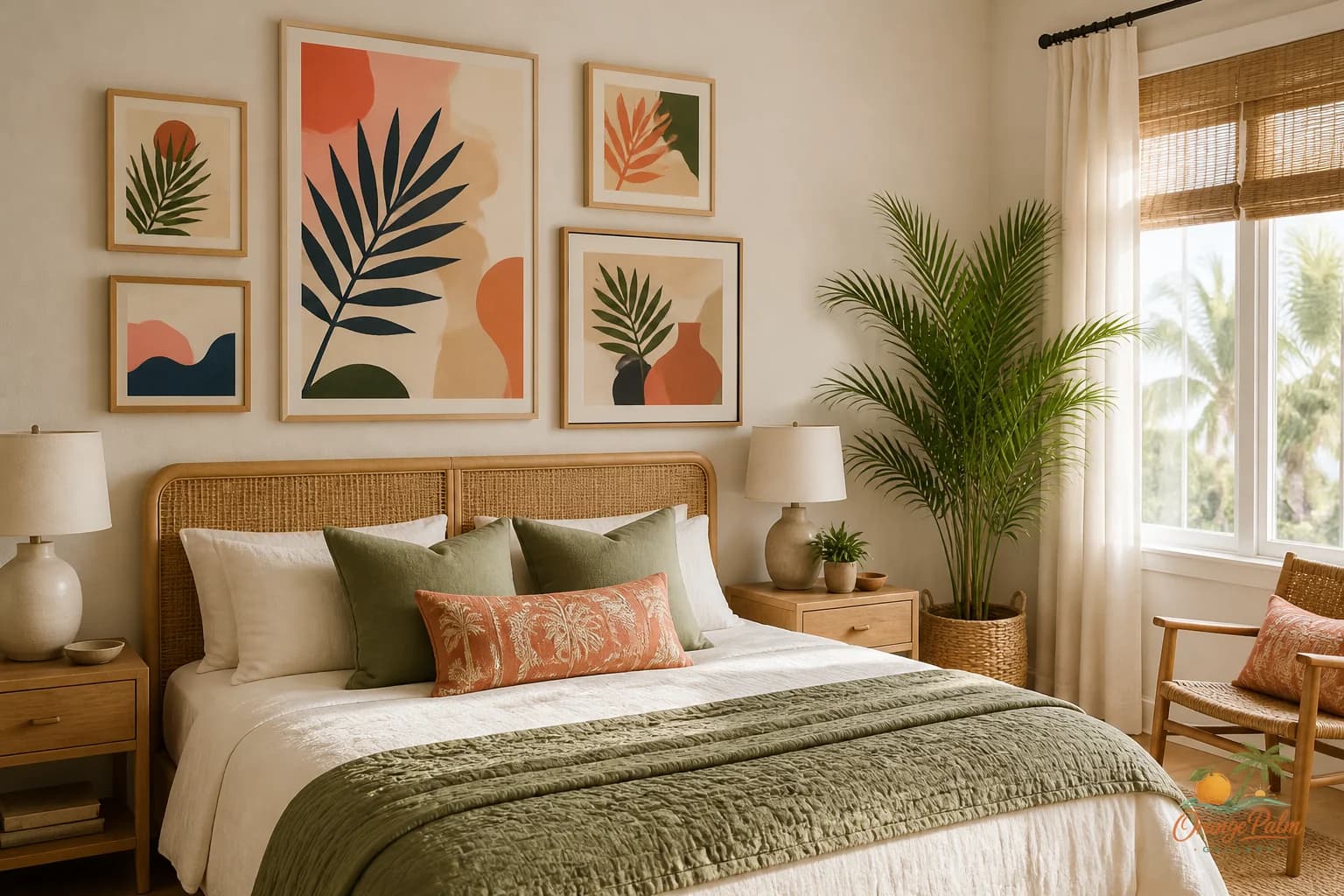
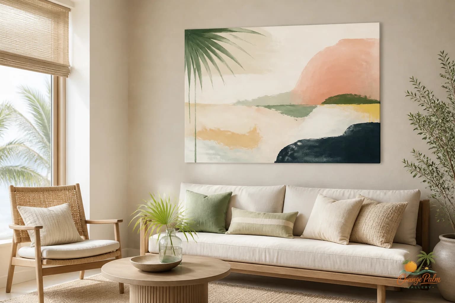
That single piece can carry enough atmosphere: warm white, sand, ink, a little palm green, maybe a coral note if the room can handle it. The subject does not have to announce Florida. A soft curve can feel like a shoreline. A dark green block can feel like shade under a palm. A washed sand tone can do more than a literal beach scene.
What people get wrong is thinking coastal decor needs evidence. It does not. The room already has water, light, towels, and hard surfaces. The art can be the part that brings breath.
Watch the mirror before you hang anything
The mirror is the boss in most bathrooms. It reflects the opposite wall, catches the doorway, and multiplies whatever sits in its path. If the art is too busy, the mirror makes it twice as busy.
Before hanging anything, stand where you actually stand in the room: at the sink, near the shower, just inside the door. Look at what the mirror sees. If the artwork will be reflected every morning, choose something with a strong shape and a calm background. Fine detail can get nervous in bathroom light.
This is where handmade feeling matters. A small irregular line, a softened edge, a little texture in the composition, those details keep a clean bathroom from feeling like a rental brochure. But the piece still needs discipline. Bathrooms do not forgive clutter.
Size it like furniture, not like an afterthought
The classic bathroom mistake is hanging a tiny piece high above the toilet and calling it finished. It usually looks stranded.
If the wall is narrow, go vertical. If the wall is squat, go square. If there is a towel bar, let the art relate to it instead of floating above it like it got lost. Leave breathing room, but do not create a lonely little island.
A practical way to think about it: the art should feel connected to one fixed thing in the room. The vanity, the towel bar, the shelf, the tile line, the mirror edge. Pick one anchor. Do not try to align with everything, because bathroom walls are full of interruptions.
Color should clean up the room
Bathroom color gets complicated fast because towels, soap labels, tile undertones, metal finishes, and shower curtains all vote. Wall art should not add another argument.
If the room already has patterned tile, go simpler with the art. If the room is mostly white, warm it up with sand, clay, muted coral, or green. If the fixtures are black or dark bronze, a little ink in the artwork can make the room feel intentional instead of randomly contrasted.
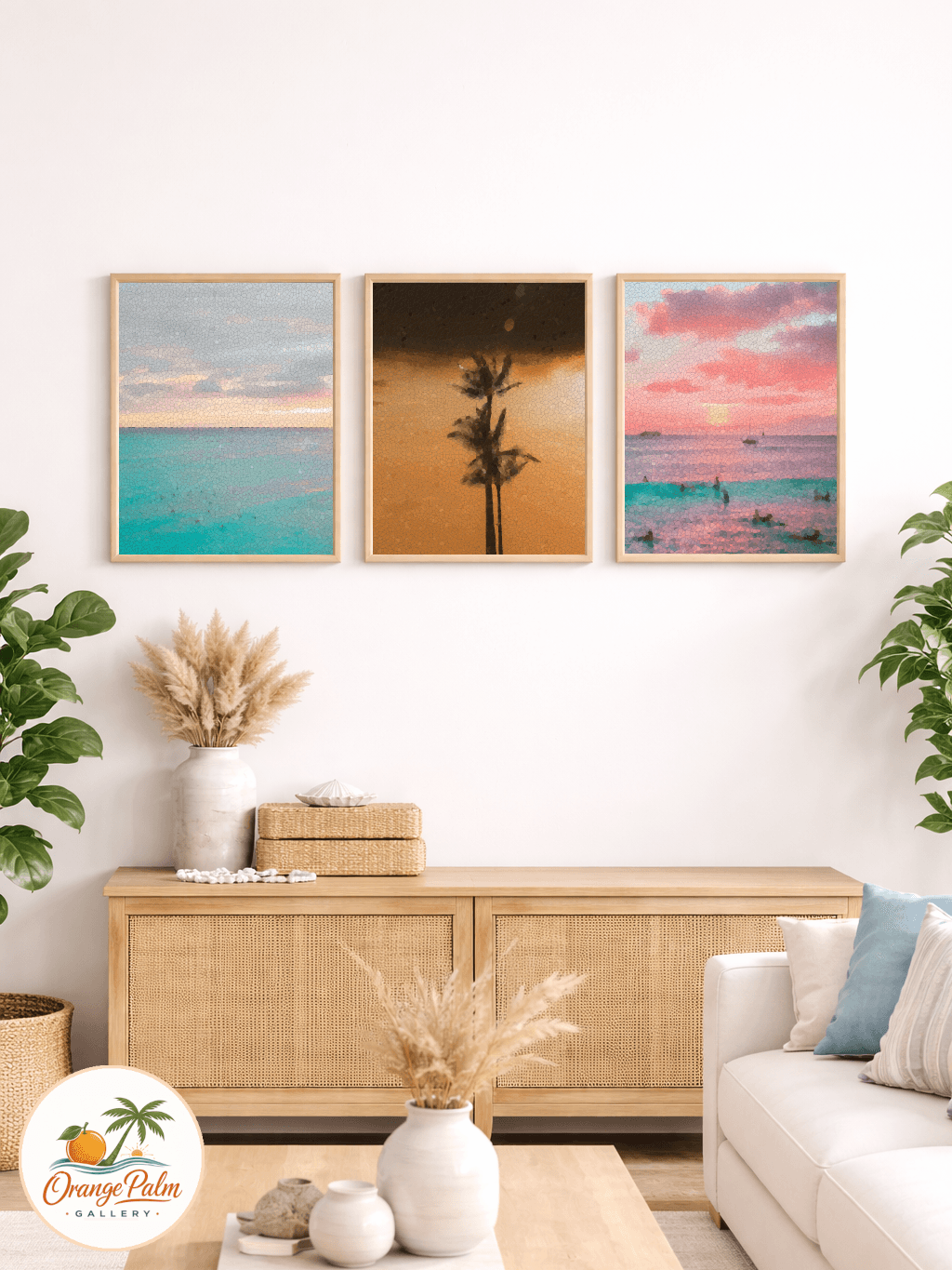
For a Florida inspired bathroom, I like color that feels sun faded rather than saturated. Coral that looks softened by light. Green that feels leafy, not neon. Sand that has warmth, not beige sadness.
The bathroom can be quiet and still have a point of view
A small bathroom is not a throwaway room. Guests see it. You see it half awake. It catches steam, glare, shadow, and all the little practical objects that no one puts in a mood board.
That is why the art has to be calm, but not dull. Clean, but not blank. Coastal, but not costumed.
One good wall note can make the room feel considered without asking the bathroom to become a gallery. That is the line I like: enough art to give the room a pulse, enough restraint to let the room stay useful.
If you are working on that kind of calm, modern Florida feeling, you can explore more Orange Palm Gallery pieces and studio notes here: https://orangepalmgallery.com/?utm_source=mdx.