Studio Notes
October Studio Notes: Citrus, White Space, and the Room That Behaves Too Well
October Studio Notes from Orange Palm Gallery on citrus green wall art, MDX first studio updates, and modern Florida inspired rooms with warmth and restraint.
October 1, 2026 / 7 min read / Orange Palm Gallery Studio
Source note: this guide is written and maintained by Orange Palm Gallery Studio. Last updated October 1, 2026.
October is when Florida rooms start asking for a different kind of attention. Not a full reset. Not a seasonal costume. More like a sharper edit: less filler, better color, one wall that does not apologize for having a point of view.
This month, Studio Notes is moving into the Orange Palm Gallery journal as an MDX first studio update. That sounds technical, but the reason is simple. These notes belong closer to the work. A studio update should sit near the prints, the room ideas, the color decisions, and the small design arguments that shape the pieces. Substack is useful for sending a note. The journal is better for keeping the note connected to the studio.
The October mood is citrus green, warm sand, and enough white space to let a room breathe without going bland. There is a particular kind of room that looks finished at first glance, then slightly overmanaged when you sit in it. Everything matches. Nothing interrupts. The pillows are behaving. The wall art is behaving. The whole room is behaving too well.
I do not think every room needs drama. I do think every room needs one honest note.
New This Month
The main shift this month is format. Studio Notes now lives here as a journal piece, built MDX first, instead of being treated like a standalone letter floating somewhere else. That gives these updates a better home. Images, product notes, room styling ideas, and studio thinking can sit together without pretending to be a campaign.
That matters for the work because Orange Palm Gallery pieces are not made as isolated graphics. They are made with rooms in mind: the too blank kitchen wall, the sunny breakfast nook, the hallway that catches afternoon light, the rental corner that needs intention without construction.
October's studio direction is cleaner and brighter than September, but not louder for the sake of it. The palette turns toward key lime, palm green, warm white, and sand. Those colors can go tacky fast if they are handled like a souvenir rack. The tradeoff is restraint. If the green gets the spotlight, the shapes need discipline. If the composition has movement, the background needs calm.
That is the line I am interested in this month: color with manners, but not color with no pulse.
Featured Product
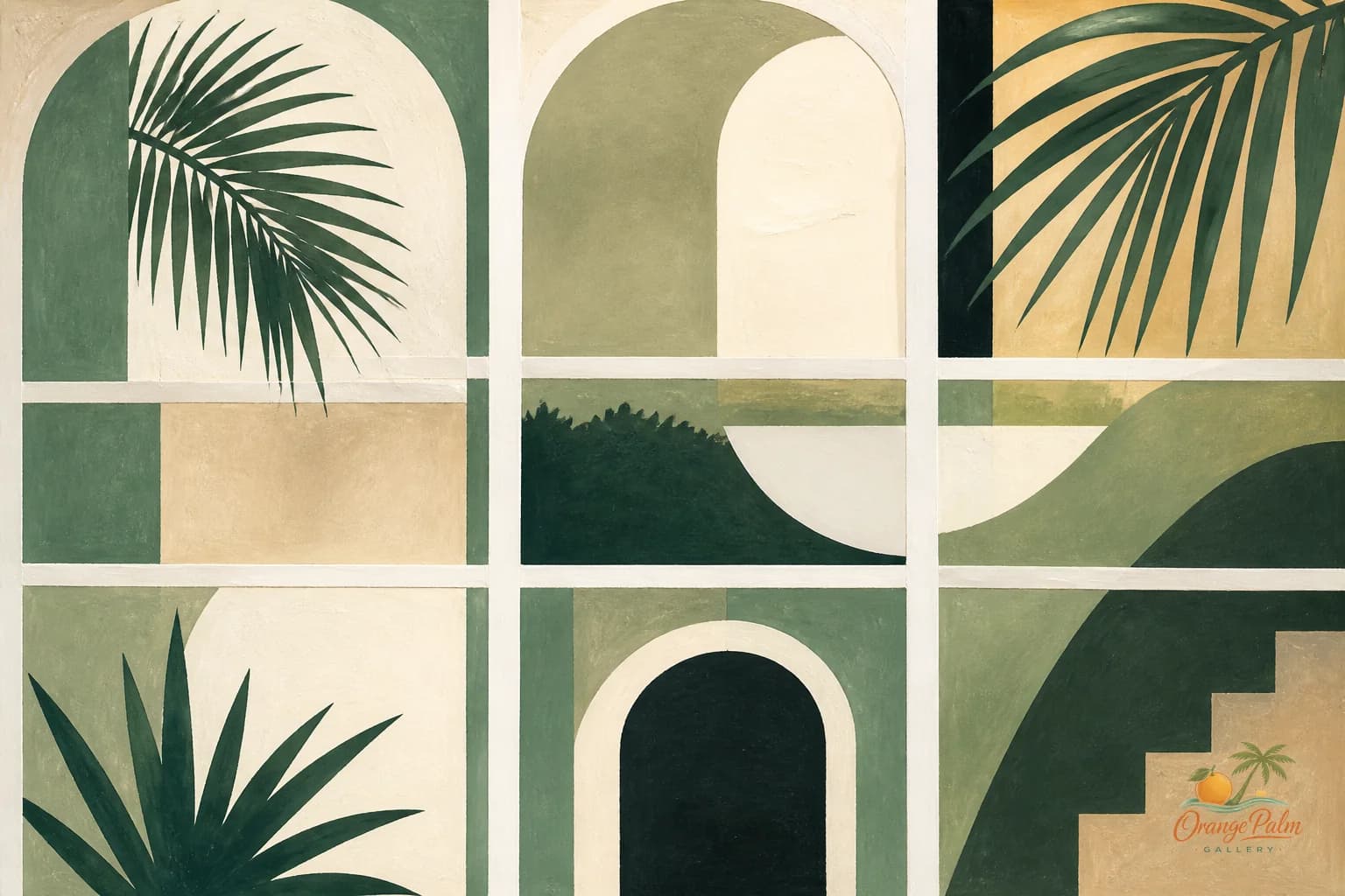
The piece in the foreground this month is Key Lime Window Grid, a printable wall art concept built around citrus green, warm sand, soft white space, and a loose grid structure.
The grid does a lot of quiet work. It keeps the green from spilling into novelty. It gives the eye a path. It makes the piece feel architectural without turning stiff. A window grid is a useful reference because it already belongs inside a home. It suggests light, panes, shadow, repetition, and a little everyday order.
What people get wrong with coastal decor is assuming the reference has to be literal. A shell. A wave. A blue stripe. A rope. Maybe those belong somewhere, but they are not the only language available. Florida can show up as citrus against white tile. As palm green beside old terrazzo. As late morning light on a breakfast table. As a print that feels sunny without announcing itself as beach art.
Key Lime Window Grid is more interested in that kind of Florida. Less theme. More temperature.
I can see it in a kitchen where the cabinets are plain and the counter is doing most of the visual work. I can see it in a breakfast nook with cane, white paint, or a small round table. I can also see it in a laundry room, which is often where good color goes to die. A utility space can handle one clean hit of citrus better than people think.
The print is not trying to match everything. That is part of the point.
Behind The Studio
The studio question for October is: how much color can a calm room take before it starts feeling like a brand board?
That is a real line. Too little color and the room becomes a waiting room with nicer lighting. Too much coordinated color and suddenly every object looks like it attended the same meeting. The better answer is usually one strong color decision, then enough texture and negative space around it to make the decision feel lived in.
For Orange Palm Gallery, handmade feeling does not mean messy. It means the edges should feel touched by a person. The composition should have a little breath in it. The color should feel chosen, not poured from a trend bucket.
October's studio work is leaning into flat compositions that still carry warmth: clean shapes, soft imbalance, coastal references that do not need props, and printable pieces that can stand on their own without a staged room doing all the selling.
There is a discipline to making digital wall art feel human. You cannot rely on paper grain alone. You need proportion, friction, and a small imperfection in the rhythm. A line that does not feel machine perfect. A block of color that holds the page without bullying it. A palette that remembers sunlight.
That is where the handmade feeling lives.
Interesting Design Fact
Green is one of the easiest colors to ruin in a home and one of the best colors when it is right.
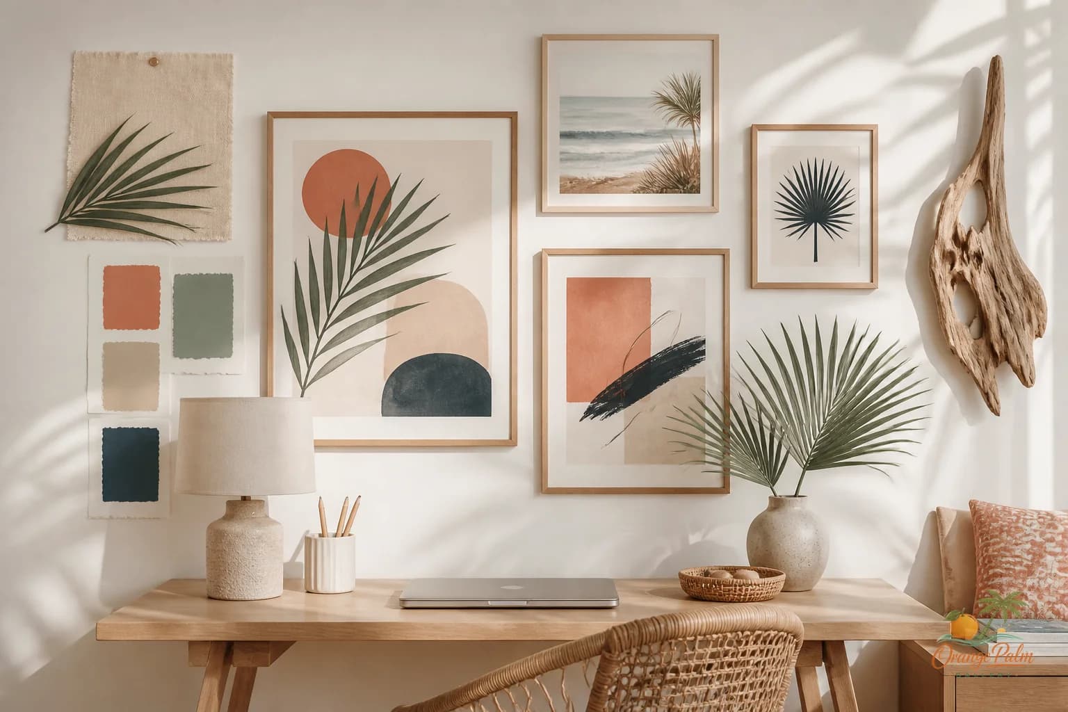
A yellow green can turn sour next to cool gray. A blue green can get heavy in a room with low natural light. A citrus green needs warmth nearby or it starts feeling plastic. That is why sand, warm white, and muted ink tones are doing important work around the key lime direction this month.
The useful move is not to repeat the green everywhere. Do not buy the green vase, the green towel, the green candle, and the green print just because they technically match. Let the print carry the color. Then support it with materials: pale wood, linen, stone, rattan, cream ceramic, old brass, something with a hand to it.
Matching is often the least interesting way to make a room feel intentional.
Community Inspiration
The room I keep thinking about this month is the almost finished room. Not the empty one. Not the renovation fantasy. The room that has furniture, decent light, and no obvious disaster, but still feels a little too polite.
Those rooms are common because safe choices accumulate quietly. A neutral sofa. A neutral rug. A neutral print. A neutral lamp. Nothing is wrong, which makes the problem harder to name. The room does not need more stuff. It needs a clearer sentence.
A citrus print can be that sentence if the rest of the room gives it space. Put it where the eye naturally lands: over a small table, near the kitchen threshold, beside open shelving, or in a corner that gets good morning light. Let it be the one thing that raises its hand.
The point is not to make the room louder. The point is to make it less vague.
Special Promotion
Use "OPGSTUDIO10" when ordering from our Etsy shop, for 30% discount between October 1st and October 31st!
That offer is for readers following along with the studio notes this month. No countdown theater, no pretend emergency. Just a small thank you for paying attention to the work and giving the pieces a place to live.
If you are choosing a print this month, start with the wall that feels unresolved every time you walk past it. Not the biggest wall. Not the wall guests see first. The one that keeps quietly bothering you.
That is usually the honest spot.
Community Question
What is the room in your home that behaves too well?
Maybe it is technically finished but a little flat. Maybe the colors are all correct and somehow still dull. Maybe you have been trying to solve it by adding another neutral object, when what it really needs is one clean interruption.
I am especially interested in kitchens, breakfast nooks, laundry rooms, and small sunny corners this month. Those spaces can take more personality than people give them credit for. They are not formal rooms. They do not need to whisper.
Closing
October is not asking for a full redesign. It is asking for a better edit.
For Orange Palm Gallery, that means Studio Notes lives closer to the studio work now. It means citrus green gets a serious seat at the table. It means Florida inspiration can be modern, warm, and specific without turning into a beach theme.
A calm home does not have to be timid. A coastal room does not have to be pale blue. A printable piece does not have to disappear politely into the background.
Sometimes the whole room improves when one small print refuses to be beige.
Explore Orange Palm Gallery pieces for calm, modern Florida-inspired homes.