Studio Notes
August Studio Notes: Heat, Edges, and a Cleaner Coastal Room
Orange Palm Gallery August Studio Notes on MDX first publishing, Florida inspired color, printable wall art, and a subscriber Etsy offer.
August 1, 2026 / 7 min read / Orange Palm Gallery Studio
Source note: this guide is written and maintained by Orange Palm Gallery Studio. Last updated August 1, 2026.
Introduction
August has a different kind of heat to it. Not just temperature, although Florida is not exactly subtle about that. It is the visual heat too: brighter sidewalks, bleached stucco, green palms looking almost black at noon, coral tones that can go from soft to loud if you let them take over the room.
That is the studio note for this month: a coastal room does not need more coastal stuff. It usually needs better editing.
The mistake is easy to make. You start with a Florida feeling, then reach for every obvious signal at once: shells, waves, blue stripes, rope texture, beach words, washed wood, maybe a palm slapped in the corner for proof. The room gets busy fast. Worse, it starts to feel like it is performing vacation instead of feeling lived in.
Orange Palm Gallery sits on the other side of that tradeoff. We are interested in modern wall art and printable pieces that carry Florida light without turning the wall into a souvenir rack. A good piece can suggest salt air, shade, citrus, stucco, palm shadow, and late afternoon warmth without drawing a cartoon map of the coast.
So August is about heat, edges, and restraint. Not blankness. Not beige for the sake of beige. Restraint with a pulse.
New This Month
This month, Studio Notes is moving to an MDX first format.
That sounds technical, but the reason is simple: these notes should live like studio material, not disappear as a newsletter-only send. MDX gives the update a cleaner home on the site, with room for art direction, product context, internal links, and future reference. Substack can still be useful for following along, but the source of the note belongs closer to the work.
That changes the writing a little. Less announcement energy. More archive energy. A Studio Notes entry should be something you can find later when you are trying to decide whether your hallway needs one strong print or three polite little ones.
The answer, annoyingly, depends. A narrow wall often wants confidence. A larger room can handle rhythm. The wrong move is choosing by quantity first. People ask, how many pieces do I need? Better question: where does the room lose its line?
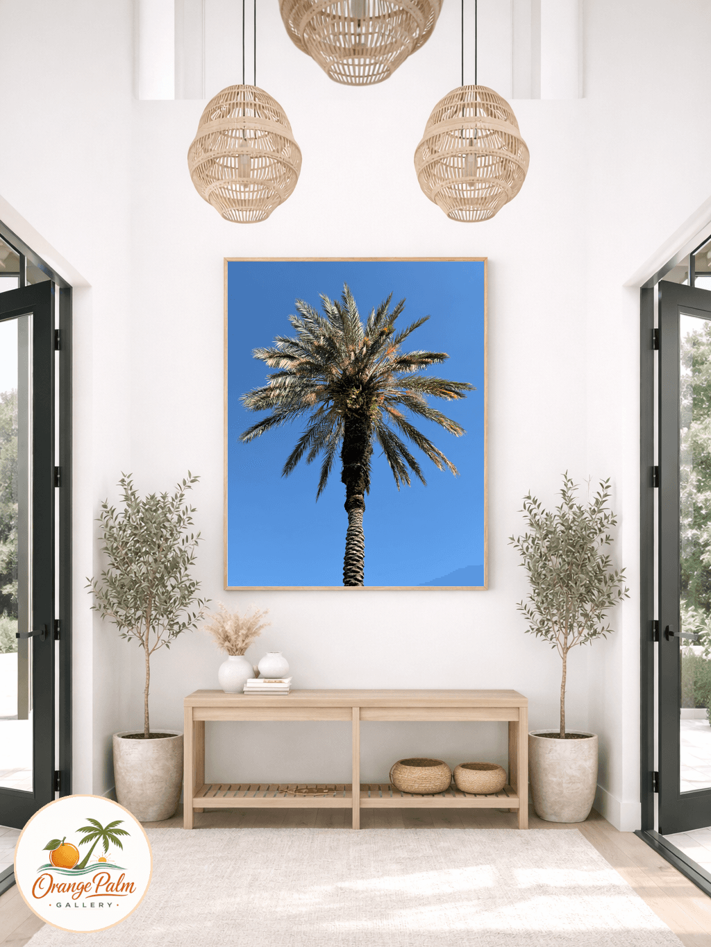
In August, the studio is paying attention to line. The edge of a palm frond. The block of shadow under a roof overhang. The hard border where hot pavement meets grass. Florida is full of soft color, but the best visual moments often come from sharp separations.
Featured Product
No fake drumroll this month. No invented launch. The featured object is the printable wall art format itself.
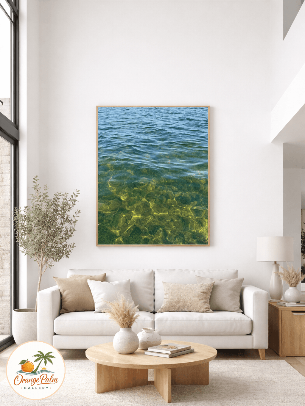
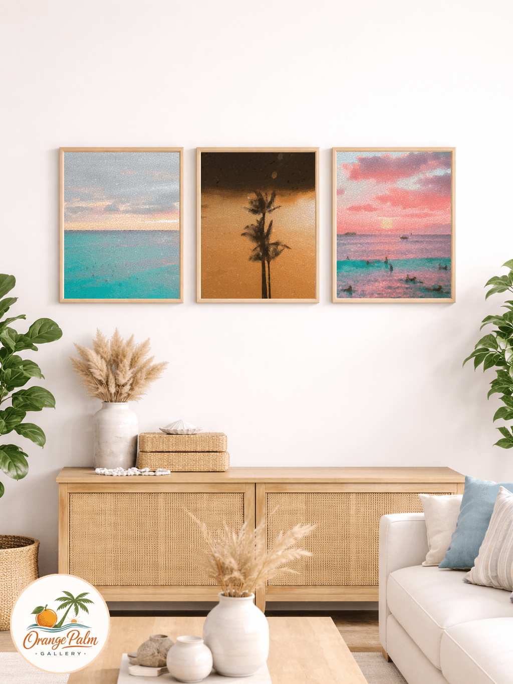
Printable art gets treated like the casual option, and sometimes that is fair. It is easy to make it feel disposable if the design is thin. But the format has a real strength: it lets the artwork stay close to the page. No room scene, no frame doing the heavy lifting, no styling trick convincing you the piece works because the sofa is expensive.
A flat printable has to hold its own.
That is why the Orange Palm Gallery visual direction keeps returning to clean composition, warm Florida light, handmade texture, and subtle coastal references. The file may be digital, but the sensibility should not feel synthetic. The page needs weight. A corner should feel considered. A color should feel mixed, not dumped from a preset.
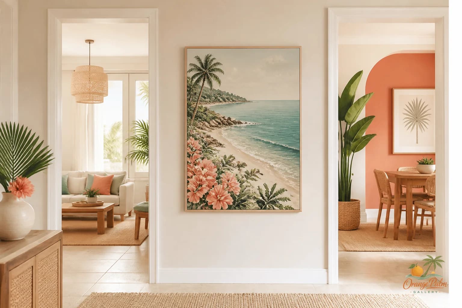
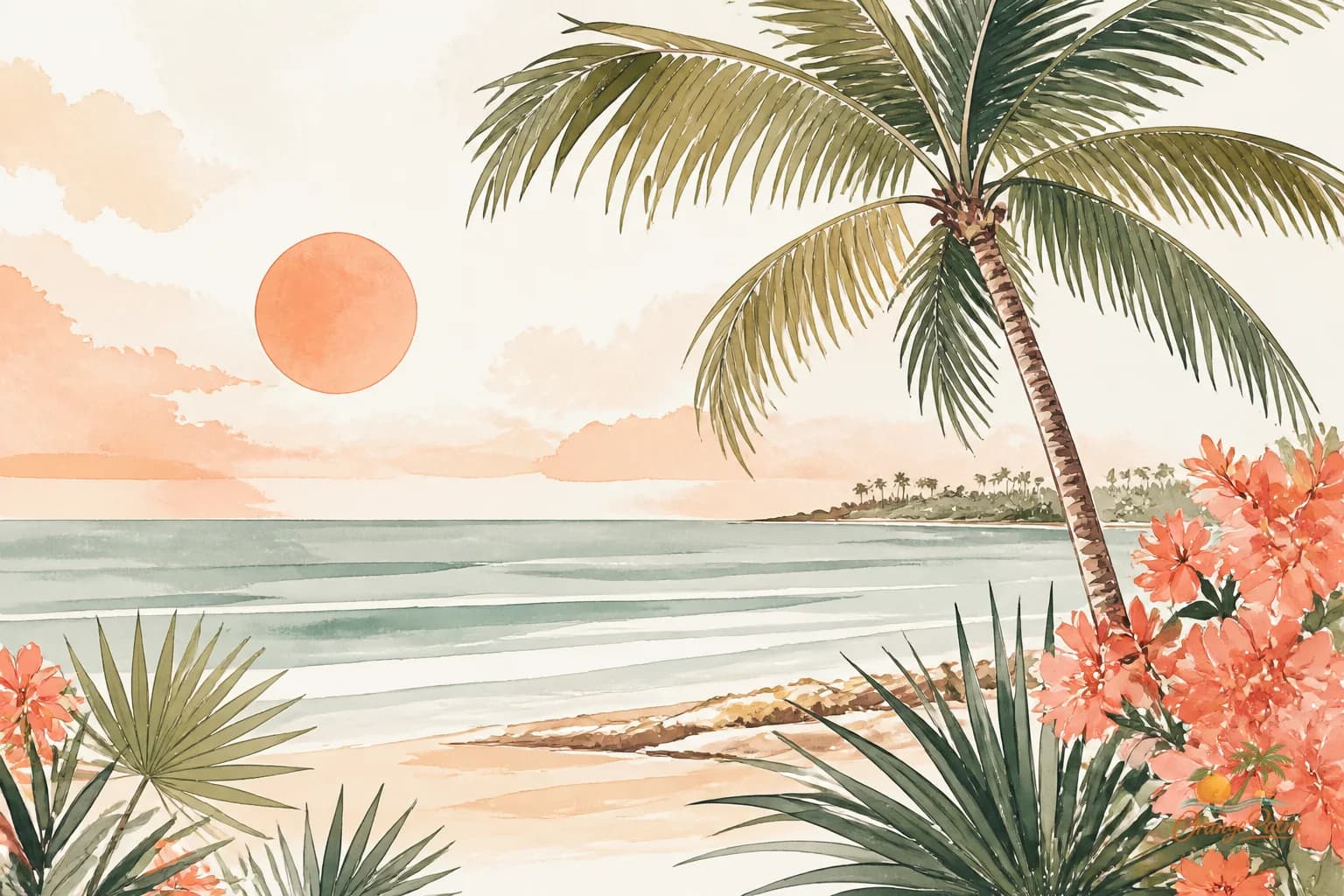
For August, the palette that keeps making sense is warm white, sand, palm green, coral, and ink. Coral is the risky one. Too much and the room starts yelling. Too little and it becomes timid. Palm green can rescue it by grounding the warmth. Ink gives the whole thing a backbone.
That is the kind of printable art we care about: not a decorative afterthought, but a small architectural decision for the wall.
Behind The Studio
The August planning pass used fresh signal work from Google autocomplete and Reddit. Not as a scoreboard. Not as proof that one style has won. More like listening with the door cracked open.
Search and discussion data can be useful, but it can also flatten taste if you obey it too literally. If every studio chases the same broad phrase, every wall starts looking like the same soft rectangle in a different room. The better use is to notice where people are struggling, then answer in the studio language instead of copying the language of the feed.
For Orange Palm Gallery, that means staying specific. Florida inspired does not have to mean nautical. Coastal does not have to mean blue. Modern does not have to mean cold. Handmade feeling does not have to mean messy.
Those are the guardrails.
The work should feel calm, but not sleepy. Warm, but not sugary. Decorative, but not empty. If a piece cannot survive without a trendy caption, it probably does not belong here.
Interesting Design Fact
Warm colors advance visually. Cooler, darker greens tend to recede. That simple tension is one reason coral and palm green can work so well together in wall art.
Coral comes forward. It catches the eye and brings a little heat into the room. Palm green holds back. It gives the eye somewhere to rest. Ink clarifies the shape. Sand and warm white keep the whole thing from feeling too graphic or too tropical.
This is also why a small artwork can change a room more than expected. Scale matters, but contrast matters too. A modest print with the right edge, color weight, and negative space can do more for a corner than a larger piece that has no point of view.
A lot of coastal decor gets this backward. It adds more motif when it should be adjusting weight.
Community Inspiration
The studio is taking community inspiration from the questions people keep circling around in search and discussion spaces: how to make a room feel coastal without making it feel themed, how to warm up modern decor, how to choose art that does not fight the furniture, how to bring color into a neutral room without committing to a full repaint.
Those are good questions because they are not really about buying one thing. They are about judgment.
Wall art sits in that strange middle place between object and atmosphere. It is visible enough to steer the room, but it does not have the bulk of a sofa or the cost of flooring. That makes it a useful place to test a mood. If you are unsure whether your room can handle coral, start with the wall. If palm green feels too heavy in paint, try it in a print. If your room is already full of texture, choose a piece with cleaner shapes.
The goal is not to make every room look like Orange Palm Gallery. The goal is to help a room stop arguing with itself.
Special Promotion
Use "OPGSTUDIO10" when ordering from our Etsy shop, for 30% discount between August 1st and August 31st!
That offer is for Studio Notes readers who want to bring a piece into the room this month. No pressure, no fake scarcity. If you have a wall that needs warmth, structure, or a little Florida light, it is there for you.
Explore Orange Palm Gallery pieces for calm, modern Florida-inspired homes.
Community Question
What is the hardest wall in your home to get right?
Not the biggest wall. The hardest one. The corner that always looks unfinished. The hallway that feels too narrow for art but too bare without it. The bedroom wall that needs calm but keeps ending up bland. The dining nook where everything looks too small.
Those awkward walls are usually more interesting than the obvious feature wall. They force better decisions. They make you think about sight lines, color temperature, and how much visual noise a room can actually hold.
If you are thinking about one now, notice what it is missing. Is it warmth? Height? Contrast? A cleaner edge? A place for the eye to land?
That answer is more useful than a style label.
Closing
August in the studio is not about adding more beach to the wall. It is about editing the signal until the room feels like itself again.
A Florida inspired home can be warm without being loud. Coastal without being themed. Modern without being sterile. Handmade feeling without looking unfinished. The good stuff usually lives in that narrow middle: enough color to feel alive, enough restraint to let the room breathe.
That is where Orange Palm Gallery is working this month.
Cleaner edges. Better heat. Less decoration that explains itself too hard.