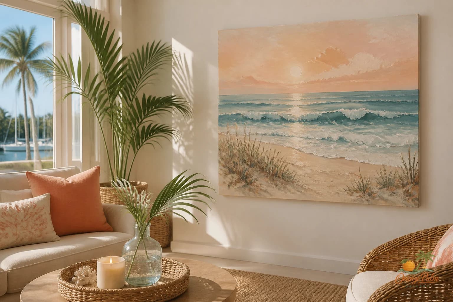
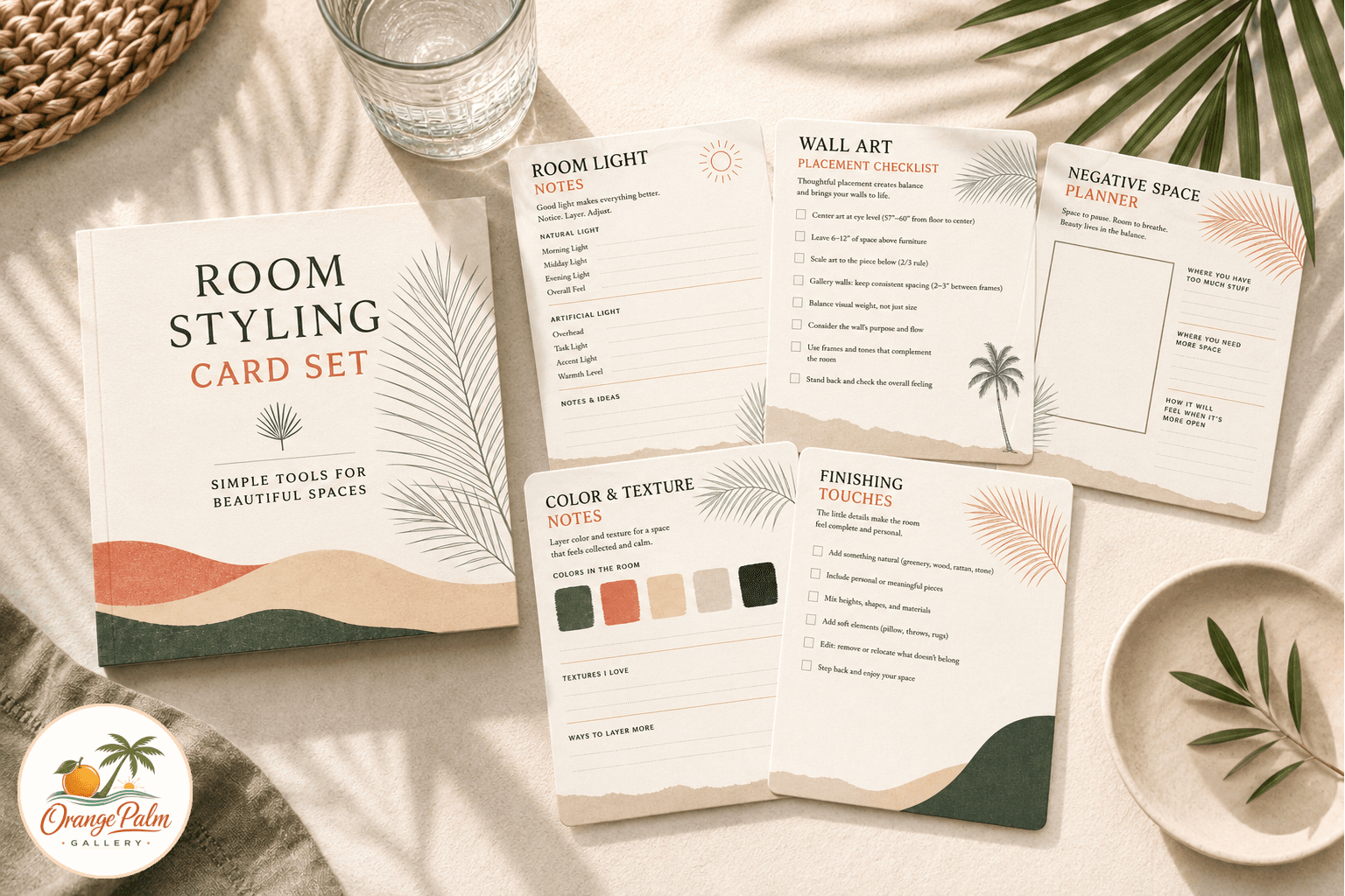
Florida Living
Measure First, Then Make the Wall Pretty
A studio note on using a printable gallery wall spacing guide to place coastal and Florida inspired art with cleaner margins, calmer rhythm, and fewer extra holes.
August 20, 2026 / 3 min read / Orange Palm Gallery Studio
Source note: this guide is written and maintained by Orange Palm Gallery Studio. Last updated August 20, 2026.
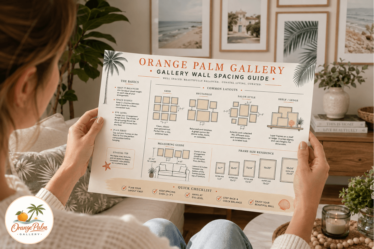
A gallery wall can look expensive or restless with the same exact art. The difference is usually not taste. It is spacing.
People tend to shop for the print first, then wrestle with the wall later. I get it. The artwork is the fun part. The measuring tape is not. But a coastal wall, especially one with soft Florida color and a little negative space, needs a quiet structure underneath it. Otherwise the pieces start floating like they were hung during a weather advisory.
This printable spacing guide is built for that unglamorous middle step: the part between liking the art and putting holes in drywall.
What people get wrong about gallery walls
Most gallery wall mistakes are small. A frame sits a little too high. Two pieces are close, but not close enough to read as a pair. The left edge almost lines up with the console table, but not quite. None of these choices feels dramatic alone. Together, they make the wall feel nervous.
Coastal rooms are especially unforgiving about this. Pale walls, woven textures, warm whites, sandy wood, and green plants leave nowhere for bad spacing to hide. The room is calm, so the layout has to be calm too.
The guide uses simple layout blocks and spacing notes so you can decide where the center line, outer edge, and breathing room should land before you start hanging. It is not meant to make the wall stiff. It is meant to keep the easy feeling from becoming sloppy.
A printable guide is slower in the right place
There is a tradeoff. Planning on paper takes a few extra minutes. It is slower than holding a frame against the wall and saying, close enough.
But it is faster than patching five tiny holes because the first version sat too high above the sofa.
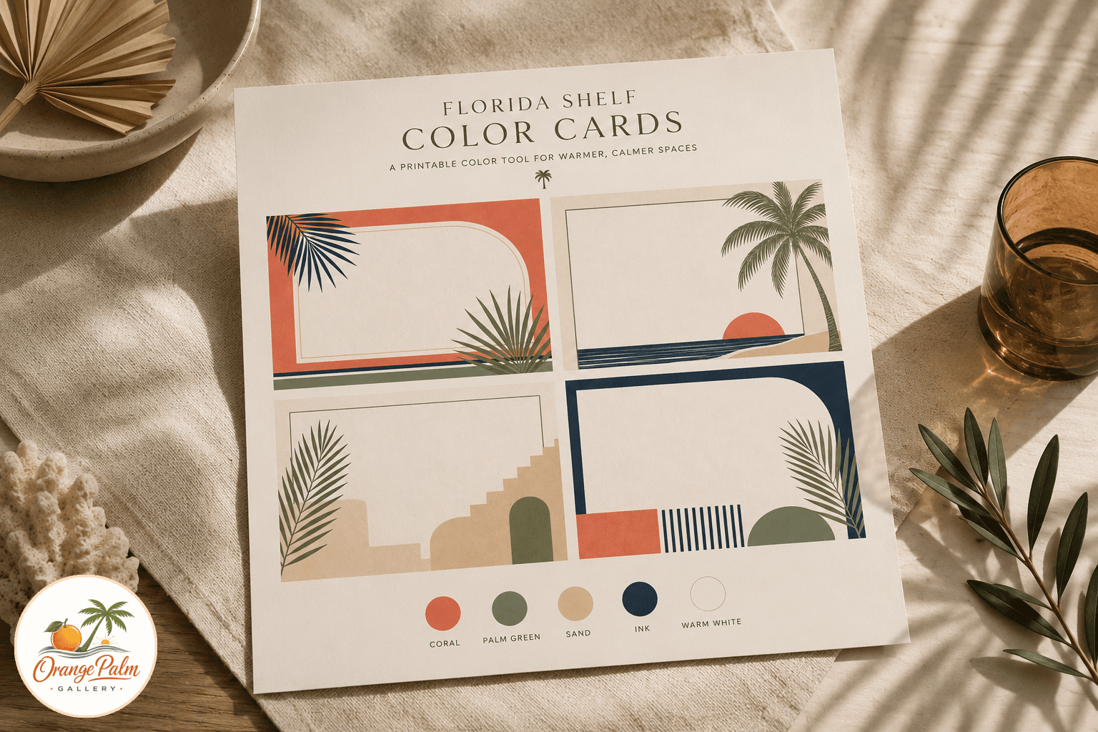
I like printable planning sheets because they keep the decision small. You can sketch the wall, mark your frame sizes, test a tighter grid, then loosen it up. For Orange Palm Gallery pieces, that matters because a lot of the work leans on quiet contrast: palm green against warm white, coral beside sand, ink lines that need room to breathe.
The guide is designed as a working sheet, not a decorative poster. Print it, write on it, cross things out, tape it to the fridge while you think. A good room usually benefits from one less rushed decision.
Where this works best
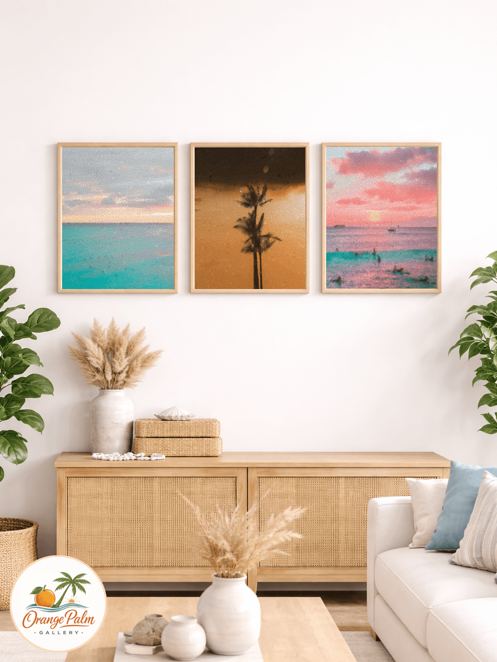
Use it for a living room wall above a sofa, an entryway with two or three prints, a hallway run, or a bedroom corner that needs art but not visual noise.
It is especially helpful when you are mixing sizes. A single large print is mostly about height. A group of prints is about rhythm. The eye wants to know whether the pieces belong together. Matching frames can help, but spacing does more work than people give it credit for.
If your room already has a lot going on, keep the layout tighter and more regular. If the room is spare, give the art a little more air. Florida light changes all day, so I also like checking placement in morning and late afternoon before committing.
The point is not perfection
A handmade feeling room should not look measured to death. The goal is not to turn your wall into graph paper.
The goal is to make the quiet choices first, so the art can do its job. A palm print, a shell study, a block of A1A morning color, or a small coastal note all read better when the wall around them feels intentional.
Measure first. Then make it pretty.